Making data accessible (and beautiful) for everybody: Meet Viridis
by Ryan Pevey
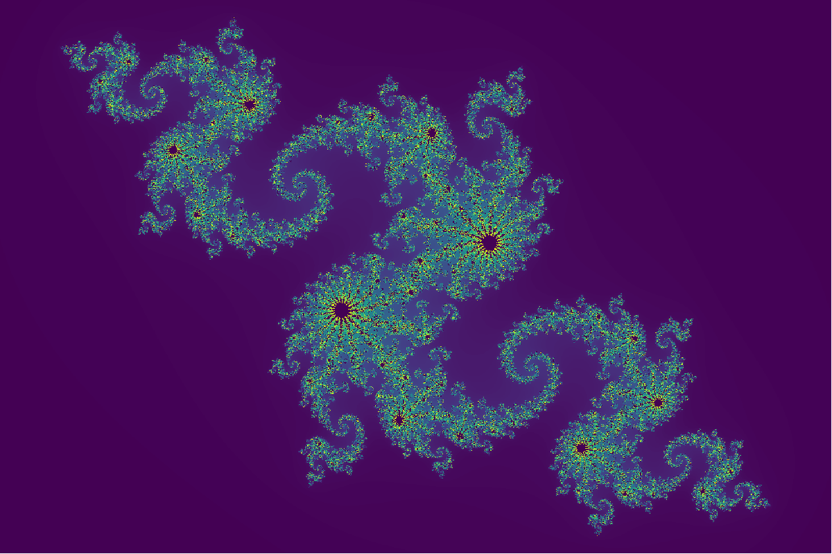
Fig. 1: The Julia set is a fractal set in the complex plane that shows these interesting patterns. This is a slight variant that has deeper branching patterns than the typical set and rotated 30° clockwise to fit the frame better. It’s also really beautiful!
I want to take a second to talk about color palettes. Riveting material, I know. What a cold open! But it’s an important part of data visualization. Done properly it highlights the data and adds to the viewers experience. It also lends itself to a visual consistency throughout a body of work that can increase the overall polish and professionalism of the project. Done improperly it can really hinder the viewers ability to understand the data. Not to mention issues for people with color blindness, or figures that vanish into grayscale oblivion when printed. The default color palettes are fine for the majority of use cases and people; but I want my data to reach as broad of an audience as possible with maximum impact and the color palette that you choose is a subtle but important part of that.
That’s where Viridis comes in, a color palette designed not just to look good, but to work better (Nuñez, 2018). It’s also my personal favorite and default color palette as you can see from my logo and my other posts. In fact, you’ve probably already seen this color palette before and just didn’t realize it as it’s common in the scientific literature especially in bioinformatics heavy papers. Also also, I just happen to think that the palette is beautiful in it’s own right.
Today’s post is a quick dive into why Viridis, and its sister palettes, are a better choice for scientific communication, data analysis, and anyone looking to maximize visual impact and inclusivity. What I’m not doing here is a tutorial, even though that’s kinda my thing here on evolio, because there already are a host of really good tutorials online. I’ve added links to a few at the end of the page though if you’re looking for recommendations.
Why Use Viridis? (And Why Ditch the Defaults?)
It’s Perceptually Uniform
A perceptually uniform palette means that equal steps in your data look like equal steps in color to the human eye. To put that another way, your ability to perceive slight shifts in color changes is not the same for every color, even if you have “normal” color vision. Especially in the green region, most people have a lower ability to perceive small changes in color in the green band of the visible spectrum compared to red and blue or the colors between them.
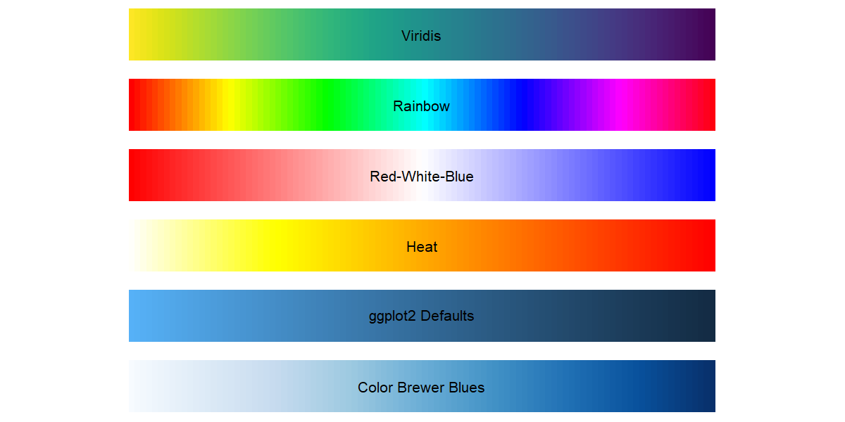
Fig. 2: Common default color palettes including the Rainbow and Viridis palettes.
Look at the palettes above. The Rainbow palette, second, is inspired by the visible spectrum of light (remember ROYGBV?) and roughly corresponds to the wavelengths of light ranging from ~380nm (violet) to ~750nm (red). Both palettes are divided into 100 distinct levels so if you can see the bands within the Rainbow scale, they represent a step of ~4nm of visible light1. For most people, some of the bands are easier to see than others, which means that your eye is more sensitive to color changes in that part of the color scale.
To my eye, the banding in Rainbow is particularly obvious in the orange, cyan and purple-magenta regions of the palette. Meaning that I’m more sensitive to perceive color changes in those regions, as are most people. So in that way the spectrum is not perceptually even across its’ range. That’s not good for data visualization. Ideally, a change in a variable of a specific amount should have the same change visually regardless of whether it falls in the high end of the range, or the low end and everywhere in between.
Viridis takes into account this change in color acuity across the range of perception by stretching some parts of the spectrum and compressing others. That leads to a palette that is more perceptually even across its’ range. If you look at the individual bands of color in the Viridis palette above, they should appear to be roughly the same change across each step of the whole palette. This, in turn, prevents your visualization from accidentally over-emphasizing (or under-emphasizing) parts of the range. So no more misleading your audience because some mid-range values happen to fall into a weird flat patch of color.
It’s Colorblind-Friendly
About 8% of males and 0.5% of females, of European descent, have some form of color blindness (Judd, 1943). The prevalence seems to be slightly lower overall in other ethnicities (Birch, 2012), but regardless, somewhere between 1-5% of the people viewing your work will have some kind of colorblindness. The prevalence of colorblindness has been roughly known for a long time, even John Dalton wrote about it way back in 1798 (Dalton, 1798).
Viridis was designed to stay distinguishable across common types of color vision deficiencies. It does that, in part2, by ramping the brightness of their color hues linearly from a relatively bright hue at the yellow end of the scale to a relatively dark hue at the purple end. If you’re familiar with the different colorspace options that are available in multimedia software (think GIMP, Inkscape, Photoshop or Illustrator), such as RGB, HSV ,or HSL; then this brightness concept that they talk about is roughly the same as the ‘Lightness’ in the HSL colorspace.
Not only that, but they created several such colormaps using the same process. Including a rainbow inspired option that follows these same principles called Turbo. Check these out!
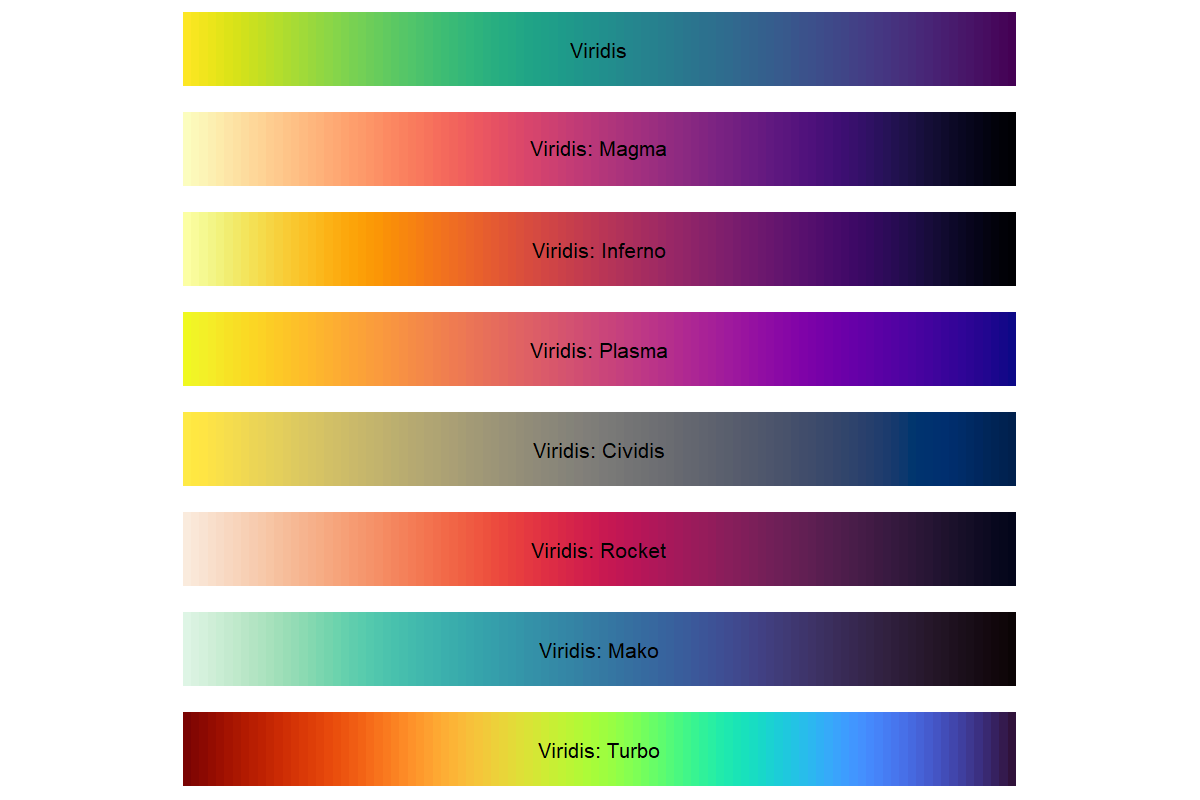
Fig. 3: Alternative palettes offered by the Viridis package.
It Converts Well to Grayscale
Do you like to print your papers in grayscale so that you have a physical copy but don’t waste all of that super expensive printer ink? Me neither, but I know people. I sometimes use an e-ink tablet for reading PDFs and until inexpensive color e-ink tablets hit the market I’m stuck in grayscale on that device. Even if you don’t do either of these things, you can’t stop some other crazy person from doing that with your data!

Fig. 4: Example scales for the default Viridis and Rainbow palettes converted to grayscale. The Rainbow scale looks like indiscernible nonsense in grayscale, but the Viridis scale remains interpretible with minimal information loss.
But Viridis wins here again, it maps smoothly into grayscale without turning your figure into a non-sensical gray blob. Just look at the Rainbow palette above in grayscale though, it’s nonsense. So much so that you didn’t notice that I reversed the scale, but you wouldn’t be able to tell anyway because it’s indiscernible in grayscale. So make the sensible pick and your plots will survive printing or e-ink tablets. Your figures stay interpretable in black and white.
It Just Looks Better
I know this point is a matter of opinion and reasonable minds disagree, but I think this palette looks great! Compared to default palettes, Viridis feels professional, clean, and modern. No awkward neon explosions. No random perceptual dead zones. The gif below is a (very) simple tornado simulation that I created in python after a conversation that my wife and I had with my brother and his wife. The color of each particle in the simulation corresponds to its elevation. This was really just an excuse for me to practice making some simple animations, but when I needed to decide what color palette to use, I knew that Viridis was the right choice.
Fig. 5: A simple tornado animation using Viridis. Color in the Viridis scale indicates height.
Closing Thoughts
Follow me on this point for a second. The Curb-Cut Effect describes when changes or improvements made specifically for accessibility (originally intended to benefit disabled individuals) end up benefiting everyone, often in unexpected ways. It’s named after curb cuts, where the curb of a sidewalk are brought down to street level smoothly so that people with movement difficulties can navigate the city they live in more easily. But many more people gain utility from the inclusion of curb cuts than the original intended beneficiaries. Any of us that have pushed around baby strollers, or my sons that are learning to ride their bikes, even just walking around your neighborhood without having to break your stride have all benefited from curb cuts.
I think the same thing happens with accessible data viz. The developers set out to create a color palette that was helpful to people with seeing disabilities and had better performance than the existing options, but they ended up with a beautiful color scale with rewards above and beyond their original intentions. Good data visualization isn’t just about looking pretty. It’s about being understood by everyone, regardless of how they perceive color. Using palettes like Viridis is a simple, high-impact choice to make your work more accessible, more accurate, and frankly, better looking in the process. It’s a small upgrade with big results and once you know about it you’ll recognize it all over the literature.
Further Reading & References
- Nuñez, J., Anderton, C., Renslow R., (2018) Optimizing colormaps with consideration for color vision deficiency to enable accurate interpretation of scientific data. PLoS ONE 13(7):e0199239. doi: 10.1371/journal.pone.0199239
- Judd, D., (1943) Facts of Color-Blindness. J. Opt. Soc. Am. 33, 294-307. doi: 10.1364%2FJOSAA.29.000313
- Birch, J., (2012) Worldwide prevalence of red-green color deficiency. J Opt Soc Am A Opt Image Sci Vis. 29(3), 313-20. doi: 10.1364/JOSAA.29.000313
- Dalton, J., (1798). Extraordinary Facts relating to the Vision of Colours: With Observations. Manchester Literary and Philosophical Society. Memoirs. 5(1), https://digital.sciencehistory.org/works/fb4949523
- Viridis vignette
- SciPy 2015 Presentation
- Viridis palette generator
- Medium: The art of color schemes in R
- R Graph Gallery
- Data Visualization Society
- Dam inventory of US and condition: a nice example of viridis
Scripts
You can find my github profile here: My GitHub profile.
Open data fuels open science.
Stay Connected
If you’re a student, researcher, or just a science enthusiast, I’d love to hear your thoughts. If you are a person with colorblindness, what are your thoughts? Reach out or follow along via RSS for more deep dives into brain research, data storytelling, and big data reanalysis.
This is an oversimplification. In reality, screens display a combination of red, green, and blue (RGB) to approximate the colors that a person with “normal” visual acuity would perceive as that corresponding wavelength of light. So they are rough approximations of the visible light spectrum, not a true mapping. This palette also loops back onto itself with blue-violet blending evenly into the red, which we perceive as magenta. Incidentally, magenta is an interesting color in itself that I’ll probably write about at some point. ↩
Again, this is an oversimplification. The developers of Viridis worked with perceptually uniform colorspaces, in particular CIELAB, to create a palette that would specifically be colorblind friendly. ↩
Leave a comment