RNA Quest Dashboard: A concise dashboard without all the fluff
by Ryan Pevey
An interesting problem in Omics research
This is a clean dashboard version of my RNA Quest project. Anybody that knows me is aware of my tendency to talk to much, and I realize that the other page is a little wordy. So this page has the code and results, with only the minimal text required to explore the results. If you’d like to see my (admittedly overly verbose) essay on reporting paradigms in Omics projects, then feel free to read through that here. The functionality of this page and the results reported otherwise, is identical to that page.
Differential expression analysis
All of the scripts for my full analysis pipeline, including downloading and preprocessing of the data before the differential expression analysis, are on my GitHub repository for this project here: RNA Quest at GitHub.
Click to expand code
library(ggplot2)
library(limma)
library(Glimma)
library(viridis)
# library(AnnotationDbi)
# library(org.Hs.eg.db)
library(DESeq2)
library(treemap)
library(gridExtra)
library(grid)
library(vsn)
library(plotly)
library(pheatmap)
library(EnhancedVolcano)
# library(htmlwidgets)
library(kableExtra)
library(tibble)

###Read in datasets
#Import read count matrix
dat <- read.delim('../../data/merged.tsv', header = TRUE, sep="\t", check.names = FALSE)

#Remove special tagged rows, the first four, from the head of dat.
dat <- dat[5:length(dat[,1]),]
#Extract Ensembl ID and gene symbols
geneID <- as.data.frame(cbind(rownames(dat), dat$gene_symbols))
colnames(geneID) <- c('EnsID', 'gene_symbols')
dat <- dat[,2:7]

#Import sample metadata.
metadata <- read.delim('../../data/SraRunMetadata.csv', header=TRUE, sep=",")

#Metadata condition as factor
metadata$condition <- factor(metadata$condition)
levels(metadata$condition) <- c('TL','TLE')
metadata$ID <- c('Ctrl1', 'Ctrl2', 'Ctrl3', 'TLE1', 'TLE2', 'TLE3')

#Create sample information table
coldata <- metadata[,c('ID','condition', 'Run')]
rownames(coldata) <- metadata$ID
#Assign row names of coldata to column names of dat
colnames(dat) <- rownames(coldata)

#Import results tables
resTable <- read.csv(paste0('../../results/','TL_TLE_allGenes_DEresults.csv'), header=TRUE)

###Create differential expression object
#This block of code is not executed, but is the code of how the DESeq object (dds) was created.
#Create sample information table
# coldata <- metadata[,c('condition','ID','Run')]
# rownames(coldata) <- metadata$SampleID
# colnames(dat) #<- metadata$SampleID

#Create DESeqDataSet object
# dds <- DESeqDataSetFromMatrix(countData = dat,
#                               colData = coldata,
#                               design = ~ condition)
# dds

#Pre-filter low count genes
#Smallest group size is the number of samples in each group (3 in this dataset).
# smallestGroupSize <- 3
# keep <- rowSums(counts(dds) >= 10) >= smallestGroupSize
# dds <- dds[keep,]

#Differential expression analysis
# dds <- DESeq(dds)
#Remove nonconverged genes
# dds <- dds[which(mcols(dds)$betaConv),]

#Load RDS files for following code chunk
dds <- readRDS('../../bin/dds_DE_TL-TLE.rds')

#Build results table
#Set contrast groups, reference level should be listed last.
contrast <- c('condition', 'TLE', 'TL')
res <- results(dds,
               contrast = contrast,
               alpha = 0.05,
               pAdjustMethod = 'BH')

#Create significant results table ordered by fold change
res05 <- res[which(res$padj < 0.05),]
res05 <- res05[order(-res05$log2FoldChange),]

#Create condition labels for report titles
status <- c('Control', 'Epilepsy')
Temporal lobe neurons of Epilepsy patients (TLE) vs. Temporal lobe neurons of Control post-mortem tissue (ref.) differential expression analysis results
There are 1576 significant differentially expressed genes (FDR < 0.05) when comparing Epilepsy to Control as reference. 758 are up-regulated, 818 are down-regulated. The results of the DE analysis are summarized in the table below. Overall, roughly the same number of genes(~3%) are down-regulated compared to up-regulated genes.
Summary of results
Click to expand code
summary(res)
## out of 26557 with nonzero total read count
## adjusted p-value < 0.05
## LFC > 0 (up)       : 758, 2.9%
## LFC < 0 (down)     : 818, 3.1%
## outliers [1]       : 36, 0.14%
## low counts [2]     : 7209, 27%
## (mean count < 22)
Gene expression dashboard
I’ve made this interactive gene expression dashboard below to help you explore the dataset. Mouse over the genes on the volcano plot to explore the highlighted significant genes. If you want to see the expression profile for that specific gene then enter it, or your favorite gene, into the gene expression plot on the right. If the gene is statistically significant, than an FDR value and bracket indicating significance are automatically populated. If not then the words “No DE result” will appear instead. If you want to restrict the gene expression plot to only display significant genes than toggle the checkbox beneath the plot. You can see the data used to create the plot with the table beneath it or download it by clicking the download graph data button to capture it as a csv.
I have the gene expression plot hosted by a Render server then piped into this page through an iframe. So if the plot isn’t loading correctly it has probably just gone inactive and you can find it here (Gene Expression Dashboard), or just reload this page, it should reactivate and load correctly.
Volcano plot
Explore Gene Expression Interactively
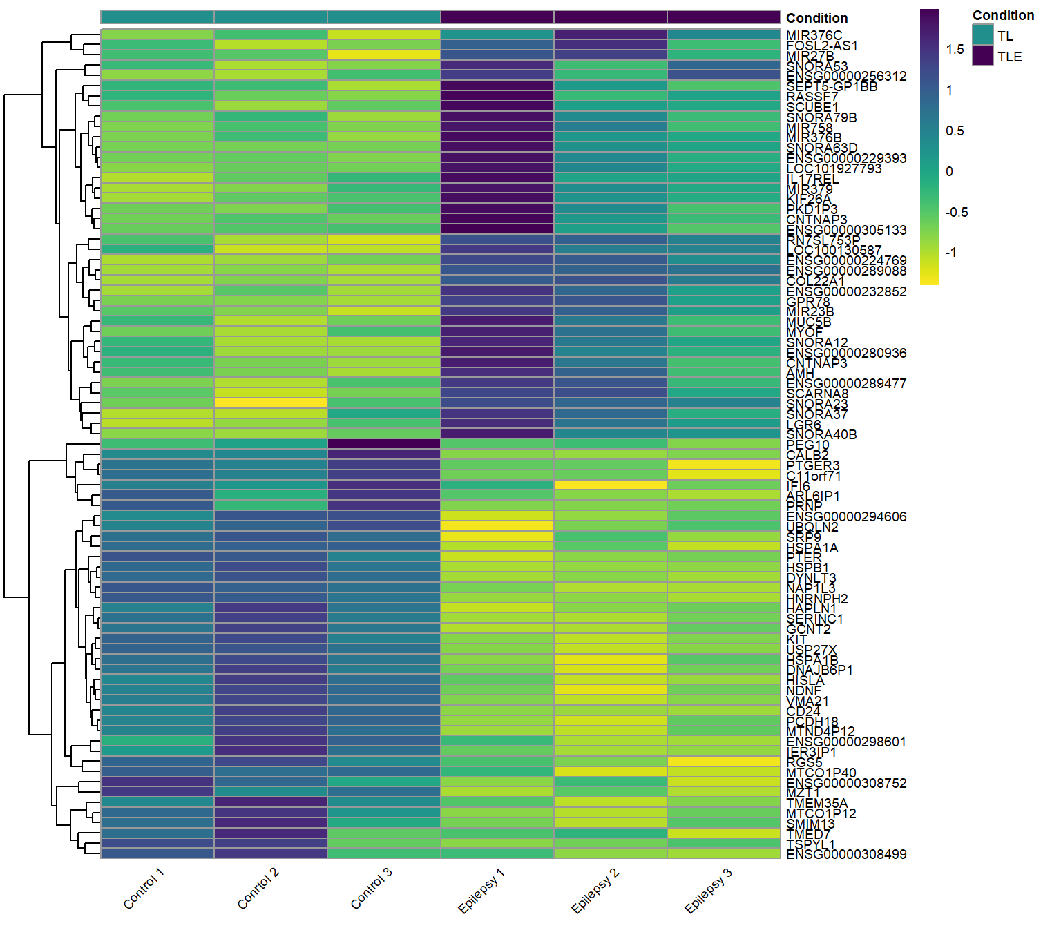
Heatmap
Up-regulated and Down-regulated genes: Epilepsy vs. Control (ref.)
Both the top up-regulated and down-regulated genes in the neurons of epilepsy patients.
Results table: Epilepsy vs. Control (ref.)
Click to expand code
# Add significant column. If the FDR is NA or higher than 0.05, than 'No'.
resTable$Significant <- ifelse(is.na(resTable$FDR) | resTable$FDR >= 0.05, "No", "Yes")
datTable <- cbind(resTable[, 2:7], resTable[, 16], resTable[, 9], resTable[, 11:14])
datTable[, 2:4] <- round(datTable[, 2:4], digits = 3)
datTable$pvalue <- formatC(datTable$pvalue, format = "e", digits = 2)
datTable$FDR <- formatC(datTable$FDR, format = "e", digits = 2)
datTable <- datTable[order(datTable$log2FoldChange, decreasing = TRUE), ]
# Reset the index to that row numbers match the order of the table.
rownames(datTable) <- NULL
colnames(datTable) <- c("Gene", "Base Mean", "log2FC", "LFC SE", "p-value", "FDR", "Significant?", "Ensembl ID",
    "Symbol", "MAP locus", "Gene type", "Gene description")
write.csv(datTable, file = "../../results/resTable1.csv", row.names = FALSE)
# resTable1.csv hosted on github and embedded as an iframe below. Import datTable datTable <-
# read.csv(paste0('../../results/','resTable1.csv'), header=TRUE)
Table 1: These are the results of the differential expression analysis when comparing, Epilepsy and Control (ref.) neurons. The columns are ordered by log2FoldChange with up-regulated genes at the top and down-regulated genes at the bottom. Numeric values listed to 3 significant digits. An FDR is not calculated for non-significant results. You can search for a gene of interest by Ensembl ID or gene name using the search box at the top.
Gene expression plots
Interesting genes: Epilepsy vs. Control (ref.)
Click to expand code
# Plot counts: highest foldChange gene
ens <- rownames(res)[which.max(res$log2FoldChange)]
plt <- plotCounts(dds, gene = ens, intgroup = "condition", normalized = TRUE, transform = TRUE, returnData = TRUE)
y_max <- max(plt$count, na.rm = TRUE)
padj_value <- format(res[ens, "FDR"], digits = 3)
levels(plt$condition) <- c("Control", "Epilepsy")

p <- ggplot(plt, aes(x = condition, y = count, color = condition)) + geom_boxplot(color = "black", outlier.shape = NA, width = 0.5) + geom_point(cex = 3, position = position_jitter(w = 0.1, h = 0)) + scale_color_viridis_d(begin = 0.75,
    end = 0.25, direction = 1) + labs(title = NULL, y = "Counts", x = "Condition") + theme_bw() + theme(text = element_text(size = 10), plot.title = element_text(hjust = 0.5), legend.position = "none",
    panel.border = element_blank(), panel.grid = element_blank(), axis.line = element_line("black"), axis.text.x = element_text(angle = 45, hjust = 1)) + scale_y_log10() + annotate("text", x = 1.5, y = y_max *
    3, label = ens) + annotate("text", x = 1.5, y = y_max * 1.5, label = paste("FDR =", padj_value)) + annotate("segment", x = 1, xend = 2, y = y_max * 1.3, yend = y_max * 1.3) + annotate("segment", x = 1,
    xend = 1, y = y_max * 1.3, yend = y_max * 1.2) + annotate("segment", x = 2, xend = 2, y = y_max * 1.3, yend = y_max * 1.2)

# Plot counts: gene of interest up-regulated
geneOfInt <- "LGR6"
ens <- geneOfInt
plt <- plotCounts(dds, gene = geneOfInt, intgroup = "condition", normalized = TRUE, transform = TRUE, returnData = TRUE)
y_max <- max(plt$count, na.rm = TRUE)
padj_value <- format(res[ens, "FDR"], digits = 3)
levels(plt$condition) <- c("Control", "Epilepsy")

q <- ggplot(plt, aes(x = condition, y = count, color = condition)) + geom_boxplot(color = "black", outlier.shape = NA, width = 0.25) + geom_point(cex = 3, position = position_jitter(w = 0.1, h = 0)) +
    scale_color_viridis_d(begin = 0.75, end = 0.25, direction = 1) + labs(title = NULL, y = "Counts", x = "Condition") + theme_bw() + theme(text = element_text(size = 10), plot.title = element_text(hjust = 0.5),
    legend.position = "none", panel.border = element_blank(), panel.grid = element_blank(), axis.line = element_line("black"), axis.text.x = element_text(angle = 45, hjust = 1)) + scale_y_log10() + annotate("text",
    x = 1.5, y = y_max * 3, label = ens) + annotate("text", x = 1.5, y = y_max * 1.5, label = paste("FDR =", padj_value)) + annotate("segment", x = 1, xend = 2, y = y_max * 1.3, yend = y_max * 1.3) + annotate("segment",
    x = 1, xend = 1, y = y_max * 1.3, yend = y_max * 1.2) + annotate("segment", x = 2, xend = 2, y = y_max * 1.3, yend = y_max * 1.2)

# Plot counts: gene of interest down-regulated
geneOfInt <- "CALB2"
ens <- geneOfInt
plt <- plotCounts(dds, gene = ens, intgroup = "condition", normalized = TRUE, transform = TRUE, returnData = TRUE)
y_max <- max(plt$count, na.rm = TRUE)
padj_value <- format(res[ens, "FDR"], digits = 3)
levels(plt$condition) <- c("Control", "Epilepsy")

r <- ggplot(plt, aes(x = condition, y = count, color = condition)) + geom_boxplot(color = "black", outlier.shape = NA, width = 0.25) + geom_point(cex = 3, position = position_jitter(w = 0.1, h = 0)) +
    scale_color_viridis_d(begin = 0.75, end = 0.25, direction = 1) + labs(title = NULL, y = "Counts", x = "Condition") + theme_bw() + theme(text = element_text(size = 10), plot.title = element_text(hjust = 0.5),
    legend.position = "none", panel.border = element_blank(), panel.grid = element_blank(), axis.line = element_line("black"), axis.text.x = element_text(angle = 45, hjust = 1)) + scale_y_log10() + annotate("text",
    x = 1.5, y = y_max * 3, label = ens) + annotate("text", x = 1.5, y = y_max * 1.5, label = paste("FDR =", padj_value)) + annotate("segment", x = 1, xend = 2, y = y_max * 1.3, yend = y_max * 1.3) + annotate("segment",
    x = 1, xend = 1, y = y_max * 1.3, yend = y_max * 1.2) + annotate("segment", x = 2, xend = 2, y = y_max * 1.3, yend = y_max * 1.2)

# Plot counts: lowest foldChange gene
ens <- rownames(res)[which.min(res$log2FoldChange)]
plt <- plotCounts(dds, gene = ens, intgroup = "condition", normalized = TRUE, transform = TRUE, returnData = TRUE)
y_max <- max(plt$count, na.rm = TRUE)
padj_value <- format(res[ens, "FDR"], digits = 3)
levels(plt$condition) <- c("Control", "Epilepsy")

s <- ggplot(plt, aes(x = condition, y = count, color = condition)) + geom_boxplot(color = "black", outlier.shape = NA, width = 0.25) + geom_point(cex = 3, position = position_jitter(w = 0.1, h = 0)) +
    scale_color_viridis_d(begin = 0.75, end = 0.25, direction = 1) + labs(title = NULL, y = "Counts", x = "Condition") + theme_bw() + theme(text = element_text(size = 10), plot.title = element_text(hjust = 0.5),
    legend.position = "none", panel.border = element_blank(), panel.grid = element_blank(), axis.line = element_line("black"), axis.text.x = element_text(angle = 45, hjust = 1)) + scale_y_log10() + annotate("text",
    x = 1.5, y = y_max * 3, label = ens) + annotate("text", x = 1.5, y = y_max * 1.5, label = paste("FDR =", padj_value)) + annotate("segment", x = 1, xend = 2, y = y_max * 1.3, yend = y_max * 1.3) + annotate("segment",
    x = 1, xend = 1, y = y_max * 1.3, yend = y_max * 1.2) + annotate("segment", x = 2, xend = 2, y = y_max * 1.3, yend = y_max * 1.2)

subplot(ggplotly(s), ggplotly(r), ggplotly(q), ggplotly(p), nrows = 1, margin = 0.01, widths = c(0.25, 0.25, 0.25, 0.25))
Methods
I am performing a reanalysis of previously published data (Pai et al., 2022). Their study, briefly, collected temporal lobe tissue from patients with medically refractory epilepsy and control donors, preparing samples for immunofluorescence, single-cell dissociation, or Fluorescence-Activated Nuclei Sorting (FANS). Using an enhanced FANS protocol, they isolated nuclei from NEUN+, OLIG2+, and PAX6+ populations and preserved RNA from sorted nuclei for downstream analysis. Total nuclear RNA was extracted, depleted of rRNA, and used to generate libraries for paired-end sequencing on an Illumina HiSeq 2500 (50 bp pair-end sequencing, 38–50 million paired-end reads/sample). They uploaded their data as fastq files to NCBI’s Gene Expression Omnibus (GEO accession: GSE140393), which is were I accessed the data on 3rd, March 2025. Sequencing reads were aligned to the human genome (ensemble: GRCh38 release 113) using STAR with default settings, and quantified gene-level expression using STAR’s ‘–quantMode GeneCounts’ option. Sorted Bam files were produced with Samtools.
Scripts
This is the R script that I used for this analysis, it has been ported into this report file. The following code is not executed, but is presented for transparency and reproducibility. Again, this is only the script that I used for the differential expression analysis. If you want all of the scripts for the full analysis including the downloading and preprocessing of the data before the differential expression, you can find it on my github repository for this project here: RNA Quest at GitHub.
Click to expand code
#This script performs differential expression analysis on the Pai et al. dataset (DOI: 10.1186/s40478-022-01453-1) using DESeq2.

library(ggplot2)
library(limma)
library(Glimma)
library(viridis)
library(AnnotationDbi)
library(org.Hs.eg.db)
library(DESeq2)
library(tidyverse)
library(treemap)
library(vsn)
library(plotly)
library(pheatmap)
library(EnhancedVolcano)
library(htmlwidgets)

#####################
###Data Management###
#####################

###Import read count matrix for TLE study
setwd(rstudioapi::selectDirectory(caption = "Select Project Directory"))
dat <- read.delim('data/merged.tsv', header = TRUE, sep="\t", check.names = FALSE)
dat[1:6,1:6]

#Remove special tagged rows, the first four, from the head of dat.
length(dat[,1])
head(dat)[,1:3]
dat <- dat[5:length(dat[,1]),]
head(dat)[,1:3]
length(dat[,1])
#Extract Ensembl ID and gene symbols
geneID <- as.data.frame(cbind(rownames(dat), dat$gene_symbols))
colnames(geneID) <- c('EnsID', 'gene_symbols')
head(geneID)
dat <- dat[,2:7]
head(dat)

#Import sample metadata.
metadata <- read.delim('data/SraRunMetadata.csv', header=TRUE, sep=",")
head(metadata)

#Metadata condition as factor
metadata$condition <- factor(metadata$condition)
levels(metadata$condition) <- c('TL','TLE')
metadata$ID <- c('Ctrl1', 'Ctrl2', 'Ctrl3', 'TLE1', 'TLE2', 'TLE3')

#Create sample information table
coldata <- metadata[,c('ID','condition', 'Run')]
rownames(coldata) <- metadata$ID
coldata
#Assign row names of coldata to column names of dat
colnames(dat) <- rownames(coldata)
head(dat)


#######################
###DESeq DE analysis###
#######################

#Create DESeqDataSet object
dds <- DESeqDataSetFromMatrix(countData = dat,
                              colData = coldata,
                              design = ~ condition)
dds

#Replace Ensembl ID with gene symbol were available
IDs <- rownames(dds)
head(IDs)
head(geneID)
colnames(geneID)[1:2] <- c('ensemblID', 'geneID')
#check that IDs and geneID match each other
all(IDs == geneID$ensemblID)
length(which(IDs!=geneID$ensemblID))
length(IDs)
length(geneID$ensemblID)
tail(IDs)
tail(geneID$ensemblID)
#Create a new gene feature column that uses gene symbol, if available, and Ensembl ID otherwise.
geneID$geneNew <- ifelse(is.na(geneID$geneID),
                         geneID$ensemblID,
                         geneID$geneID)

#Check that geneNew shows desired output for missing gene symbols
head(geneID)
#Spot check random IDs and ensemblIDs for sanity check
rndm <- round(runif(10, min = 0, max = length(IDs)), digits = 0)
IDs[rndm]
geneID[rndm,]

#Add gene annotations
gene_info <- AnnotationDbi::select(org.Hs.eg.db,
                    keys = geneID$ensemblID,
                    columns = c("SYMBOL", "MAP", "GENETYPE", "GENENAME"),
                    keytype = "ENSEMBL")
head(gene_info)
#return only unique mappings
gene_info <- gene_info[isUnique(gene_info$ENSEMBL),]
#geneID and gene_info do not match yet
all(geneID$ensemblID == gene_info$ENSEMBL)
gene_info <- merge(geneID, gene_info,
                   by.x = "ensemblID",  # Column in colData to match
                   by.y = "ENSEMBL",    # Column in gene_info to match
                   all.x = TRUE)  # Keep all colData rows
# Restore original order of colData
gene_info <- gene_info[match(geneID$ensemblID, gene_info$ensemblID), ]
#Now they do match!
all(geneID$ensemblID == gene_info$ENSEMBL)
head(geneID)
head(gene_info)

#Add geneID to dds metadata
mcols(dds) <- cbind(mcols(dds), gene_info)
rownames(dds) <- geneID$geneNew

#Pre-filter low count genes
#Smallest group size is the number of samples in each group (3 in this ).
smallestGroupSize <- 3
keep <- rowSums(counts(dds) >= 10) >= smallestGroupSize
dds <- dds[keep,]

#Confirm factor levels
dds$ID
dds$condition
dds$Run
# mcols(dds)$MAP

#Differential expression analysis
dds <- DESeq(dds)
#Remove nonconverged genes
dds <- dds[which(mcols(dds)$betaConv),]
boxplot(log2(counts(dds, normalized = TRUE)+1), axes = FALSE, ylab = 'log2 counts')
axis(1, labels = FALSE, at = c(seq(1,40,1)))
axis(2, labels = TRUE)
text(x = seq_along(colnames(dds)), y = -2, labels = colnames(dds),
     # srt = 45,    #rotate
     adj = 0.5,    #justify
     xpd = TRUE, #print outside of plot area
     cex = 0.75)  #smaller font size

#Plot dispersion estimates
plotDispEsts(dds)

#Save an rds file to start the script here
# saveRDS(dds, 'bin/dds_DE_TL-TLE.rds')
# dds <- readRDS('bin/dds_DE_TL-TLE.rds')


#########################
###Build results table###
#########################

levels(dds$condition)
#Set contrast groups, reference level should be listed last.
contrast <- c('condition', 'TLE', 'TL')
res <- results(dds,
               contrast = contrast,
               alpha = 0.1,
               pAdjustMethod = 'BH')
res
summary(res)

#How many adjusted p-values are less than 0.1?
sum(res$padj < 0.1, na.rm=TRUE)
table(res$padj < 0.1)
#Create significant results table ordered by fold change
res10 <- res[which(res$padj < 0.1),]
res10 <- res10[order(-res10$log2FoldChange),]
#How many adjusted p-values are less than 0.05?
sum(res$padj < 0.05, na.rm=TRUE)
table(res$padj < 0.05)

#How many up-regulated (FDR < 0.1)
length(which(res10$log2FoldChange > 0))
#How many down-regulated (FDR < 0.1)
length(which(res10$log2FoldChange < 0))
bar <- data.frame(direction = c('up','down'), genes = c(length(which(res10$log2FoldChange > 0)),length(which(res10$log2FoldChange < 0))))
bar

#Log fold change shrinkage for visualization and ranking, especially since we only have 3 samples per group
plotMA(res, ylim=c(-3,3))
resultsNames(dds)
resLFC <- lfcShrink(dds, contrast = contrast, type = 'ashr')
resLFC
plotMA(resLFC, ylim=c(-3,3))
res <- resLFC

#Add geneID variables
res$geneNew <- row.names(res)
res_annotated <- merge(as.data.frame(res), gene_info, by="geneNew", all.x=TRUE)
head(mcols(dds)[3])
head(res_annotated)

#Write out results table
#Reorder columns and order results table by smallest p-value
colnames(res_annotated)[1] <- 'gene'
colnames(res_annotated)[6] <- 'FDR'
res_annotated <- res_annotated[order(res_annotated$FDR),]
head(res_annotated)
# write.csv(as.data.frame(res_annotated), file=paste0('results/','TL','_','TLE','_allGenes_DEresults.csv'), row.names = TRUE)

#Glimma MD plot
res.df <- as.data.frame(res_annotated)
res.df$log10MeanNormCount <- log10(res.df$baseMean)
idx <- rowSums(counts(dds)) > 0
res.df <- res.df[idx,]
res.df$FDR[is.na(res.df$FDR)] <- 1
res.df <- res.df[isUnique(res.df$gene),]
exm <- res.df[,c(1:6,13)]
rownames(exm) <- exm$gene
anno <- res.df[,c(1,7:12)]
rownames(anno) <- anno$gene
# color_vector <- viridis(100)[cut(exm$FDR, breaks=100)]
# de_colors <- setNames(viridis(3), c('DE', 'Not Sig', 'Not DE'))
de_colors <- viridis(3)
status <- ifelse(exm$FDR < 0.05 & abs(exm$log2FoldChange) > 1, 'DE',
                 ifelse(exm$FDR > 0.05 & abs(exm$log2FoldChange) < 1, 'Not Sig', 'Not DE'))

glMDPlot(exm,
         xval = 'log10MeanNormCount',
         yval = 'log2FoldChange',
         anno = anno,
         groups = dds$condition,
         # cols = de_colors,
         cols = c('#BEBEBEFF', '#440154FF', '#21908CFF'),
         status = status,
         samples = colnames(dds)
)


#########
###EDA###
#########

#Create treemap of gene biotypes for all genes
biotype_all <- data.frame(table(mcols(dds)$GENETYPE))
biotype_all$Var1 <- gsub('_',' ',biotype_all$Var1)
biotype_all <- biotype_all[order(biotype_all$Freq, decreasing = TRUE),]
# png(filename='results/figs/tree.png',width=800, height=1295)
treemap(biotype_all,
        index = 'Var1',
        vSize = 'Freq',
        type = 'index',
        palette = viridis(length(biotype_all$Var1)),
        aspRatio = 1/1.618,
        title = '',
        inflate.labels = TRUE,
        lowerbound.cex.labels = 0
)
# dev.off()

#Create treemap of gene biotypes for significant results genes
res_annotated$GENETYPE <- as.factor(res_annotated$GENETYPE)
levels(res_annotated$GENETYPE)
biotype_sig <- data.frame(
  table(
    res_annotated$GENETYPE[which(res_annotated$FDR < 0.05)]
    )
  )
biotype_sig$Var1 <- gsub('_',' ',biotype_sig$Var1)
biotype_sig <- biotype_sig[order(biotype_sig$Freq, decreasing = TRUE),]
# png(filename='results/figs/tree.png',width=800, height=1295)
treemap(biotype_sig,
        index = 'Var1',
        vSize = 'Freq',
        type = 'index',
        palette = viridis(length(biotype_sig$Var1)),
        aspRatio = 1/1.618,
        title = '',
        inflate.labels = TRUE,
        lowerbound.cex.labels = 0
)
# dev.off()
biotype <- merge(biotype_all, biotype_sig, by = 'Var1')
colnames(biotype) <- c('biotype','AllGenes','SigGenes')
biotype <- biotype[order(biotype$AllGenes, decreasing = TRUE),]
# Combine rows with low counts into 'other' for the Chi-squared test.
biotype <- rbind(biotype,c('other', sum(biotype$AllGenes[4:8]), sum(biotype$SigGenes[4:8])))
biotype <- biotype[c(1:3,9),]
biotype$AllGenes <- as.integer(biotype$AllGenes)
biotype$SigGenes <- as.integer(biotype$SigGenes)
biotype$AllProp <- round(biotype$AllGenes/sum(biotype$AllGenes), digits = 3)
biotype$SigProp <- round(biotype$SigGenes/sum(biotype$SigGenes), digits = 3)
biotype <- biotype[,c(1,2,4,3,5)]
biotype
# Perform Chi-Squared Goodness-of-Fit Test
# Compute total counts
total_all <- sum(biotype$AllGenes)  # Total genes
total_sig <- sum(biotype$SigGenes)  # Total significant genes
# Compute expected counts under the null hypothesis
biotype$Expected <- total_sig * (biotype$AllGenes / total_all)
chi_sq_test <- chisq.test(biotype$SigGenes, p = biotype$AllGenes / total_all, rescale.p = TRUE)
# Print results
print(chi_sq_test)

#VST for visualization and ranking, generally scales well for large datasets
vsd <- vst(dds, blind = FALSE)
head(assay(vsd), 3)
meanSdPlot(assay(vsd))
#NTD for visualization and ranking
ntd <- normTransform(dds)
head(assay(ntd), 3)
meanSdPlot(assay(ntd))
#rlog for visualization and ranking, generally works well for small datasets
rld <- rlog(dds, blind = FALSE)
head(assay(rld), 3)
meanSdPlot(assay(rld))
#I'll use rld for visualization moving forward, because of the small sample size.

#Dimensional reduction EDA
#PCA plot
plotPCA(rld, intgroup='condition')
plotPCA(rld, intgroup='condition', pcsToUse=3:4)

#MDS plot
# rld <- calcNormFactors(rld)
sampleDists <- dist(t(assay(rld)))
sampleDistMatrix <- as.matrix(sampleDists)
mdsData <- data.frame(cmdscale(sampleDistMatrix))
mds <- cbind(mdsData, as.data.frame(colData(rld)))
ggplot(mds, aes(X1,X2,color=condition,shape=condition)) + geom_point(size=3)

#######################
###Visualize results###
#######################

#Create a function that will output a standalone html file of a plotly figure for integration into the subsequent markdown report.
# setwd('results/figs/')
# outdir <- getwd()
saveInteractivePlot <- function(plot, outdir, filename) {
  # Ensure the output directory exists
  if (!dir.exists(outdir)) {
    dir.create(outdir, recursive = TRUE)
  }
  # Construct full file path
  file_path <- file.path(outdir, filename)
  # Save the widget
  saveWidget(plot, file_path, selfcontained = TRUE)
  # Read the saved HTML file
  html_content <- readLines(file_path)
  # Write the modified HTML file back
  writeLines(html_content, file_path)
  message("Interactive plot saved successfully: ", file_path)
}

#Data Quality assessment by sample clustering and visualization
ann_colors = viridis(3, begin = 0, end = 1, direction = -1)
ann_colors = list(Condition = c(TL=ann_colors[2], TLE=ann_colors[3]))
# df <- as.data.frame(colData(dds)[,'condition'])
df <- data.frame(Condition = colData(dds)[, 'condition'])
rownames(df) <- colnames(dds)  # Ensure row names match colnames in heatmap

select <- order(rowMeans(counts(dds, normalized = TRUE)),
                decreasing = TRUE)[1:10]
#Declare expression matrix
# rld <- rld[,c(which(rld$condition=='TL'),which(rld$condition=='TLE'))]
rld <- rld[,c(which(rld$condition==contrast[2]),which(rld$condition==contrast[3]))]
# Extract sample names in the correct order (TL first, then TLE)
ordered_samples <- colnames(rld)[order(rld$condition)]
pheatmap(assay(rld)[select,ordered_samples],
         cluster_rows = TRUE,
         show_rownames = TRUE,
         cluster_cols = FALSE,
         annotation_col = df,
         annotation_colors = ann_colors,
         color = viridis(n=256, begin = 0, end = 1, direction = -1),
         labels_row = mcols(rld)$geneNew
         )

# select <- assay(rld)[head(order(res$FDR),100),]
#Up-regulated genes
geneNum <- 40
selectUp <- assay(rld)[rownames(res10),ordered_samples][1:geneNum,]
selectUpNames <- rownames(res10)[1:geneNum]
selectUpNames <- which(rownames(dds)%in%selectUpNames)
zUp <- (selectUp - rowMeans(selectUp))/sd(selectUp) #z-score
pheatmap(zUp,
         cluster_rows = TRUE,
         show_rownames = TRUE,
         cluster_cols = FALSE,
         annotation_col = df,
         annotation_colors = ann_colors,
         labels_row = mcols(rld)$geneNew[selectUpNames],
         color = viridis(n=256, begin = 0, end = 1, direction = -1))

#Down-regulated genes
geneNum <- 40
selectDown <- assay(rld)[rownames(res10),ordered_samples][(length(res10[,1])-geneNum):length(res10[,1]),]
selectDownNames <- rownames(res10)[(length(res10[,1])-geneNum):length(res10[,1])]
selectDownNames <- which(rownames(dds)%in%selectDownNames)
zDown <- (selectDown - rowMeans(selectDown))/sd(selectDown) #z-score
pheatmap(zDown,
         cluster_rows = TRUE,
         show_rownames = TRUE,
         cluster_cols = FALSE,
         annotation_col = df,
         annotation_colors = ann_colors,
         labels_row = mcols(rld)$geneNew[selectDownNames],
         color = viridis(n=256, begin = 0, end = 1, direction = -1))

#Up and Down-regulated genes
selectUpDownNames <- c(selectUpNames,selectDownNames)
zUpDown <- rbind(zUp, zDown) #z-score
# setwd('results/figs/')
# tiff(filename= paste0('TLE','_','TL','_upDownHeatmap.tiff'),width=1200, height=1000)
gap_index <- sum(df$Condition == "TL")
pheatmap(zUpDown,
         fontsize = 8,
         cluster_rows = TRUE,
         show_rownames = TRUE,
         cluster_cols = FALSE,
         annotation_col = df,
         annotation_colors = ann_colors,
         # gaps_col = gap_index,
         labels_row = mcols(rld)$geneNew[selectUpDownNames],
         labels_col = "",
         show_colnames = TRUE,
         color = viridis(n=256, begin = 0, end = 1, direction = -1))
# dev.off()

#Volcano plot
EnhancedVolcano(res, lab = rownames(res), x = 'log2FoldChange', y = 'pvalue',
                # title = paste0(contrast[2], ' vs. ', contrast[3]),
                title = bquote('TL vs. TLE'),
                subtitle = NULL,
                legendPosition = 'none',
                pCutoff = 10e-6,
                FCcutoff = 1,
                boxedLabels = TRUE,
                drawConnectors = TRUE,
                colConnectors = 'black',
                widthConnectors = 1.0,
                arrowheads = FALSE,
                col = c('grey30', viridis(3, direction = -1)), colAlpha = 0.7,
                gridlines.major = FALSE,
                gridlines.minor = FALSE) #+ coord_flip()


#Interactive volcano plot
# Set thresholds
fdr_cutoff <- 0.001
logfc_cutoff <- 1
# Set colors
sig_colors <- viridis(3, direction = -1)
# Set tooltip text
res_annotated$tooltip <- paste0(
  res_annotated$gene,
  "<br>log₂FC: ", round(res_annotated$log2FoldChange, 3),
  "<br>FDR: ", signif(res_annotated$FDR, 3)
)

res_annotated$Significant <- ifelse(
  res_annotated$FDR < fdr_cutoff & abs(res_annotated$log2FoldChange) > logfc_cutoff, "Sig",
  ifelse(
    res_annotated$FDR > fdr_cutoff & abs(res_annotated$log2FoldChange) >= logfc_cutoff, "nonDE",
    "nonSig"
  )
)

volcano <- ggplot(res_annotated, aes(x = log2FoldChange, y = -log10(pvalue), text = tooltip)) +
  geom_point(aes(color = Significant), alpha = 0.7) +
  scale_color_manual(values = c("nonSig" = "gray40", "Sig" = sig_colors[3], "nonDE" = sig_colors[1])) +
  labs(
    x = "log₂ Fold Change",
    y = "-log₁₀(p-value)"
  ) +
  theme_minimal(base_size = 14) +
  theme(
    panel.grid.major = element_blank(),
    panel.grid.minor = element_blank(),
    panel.background = element_rect(fill = "white", color = NA),
    plot.background = element_rect(fill = "white", color = NA),
    axis.line = element_line(color = "black"),
    axis.ticks = element_line(color = "black"),
    axis.text = element_text(color = "black"),
    axis.title = element_text(color = "black")
  ) +
  theme(legend.position = "none") +
  # Horizontal line (significance)
  geom_hline(
    yintercept = 5,
    linetype = "dashed",
    color = "black",
    linewidth = 0.3
  ) +
  # Vertical lines (logfc)
  geom_vline(
    xintercept = -logfc_cutoff,
    linetype = "dashed",
    color = "black",
    linewidth = 0.3
  ) +
  geom_vline(
    xintercept = logfc_cutoff,
    linetype = "dashed",
    color = "black",
    linewidth = 0.3
  )

ggplotly(volcano, tooltip = "text")


#Plot counts highest foldChange gene
plotCounts(dds, gene = rownames(res)[which.max(res$log2FoldChange)], intgroup = 'condition', normalized = TRUE, transform = TRUE)

plt <- plotCounts(dds, gene = rownames(res)[which.max(res$log2FoldChange)], intgroup = 'condition', normalized = TRUE, transform = TRUE, returnData=TRUE)

ggplot(plt, aes(x=condition, y=count)) +
  geom_point(position=position_jitter(w=0.1,h=0)) +
  labs(title = rownames(res)[which.max(res$log2FoldChange)]) +
  # labs(title = rownames(res)[which.min(res$padj)]) +
  theme(plot.title = element_text(hjust = 0.5)) +
  #scale_y_log10(breaks=c(25,100,400))
  scale_y_log10()

#Create annotation function for significance bracket
annotate_significance <- function(p) {
  # Extract gene of interest data
  y_max <- max(plt$count, na.rm = TRUE)
  padj_value <- res[ens, "padj"]
  # Compute positions for bracket and text
  y_bracket <- y_max * 1.30  # 5% above max expression
  y_text <- y_max * 1.5     # 10% above max
  # Add annotation to the plot
  p <- p +
    # Horizontal line (bracket)
    annotate("segment", x = 1, xend = 2, y = y_bracket, yend = y_bracket) +
    # Vertical ticks at each end
    annotate("segment", x = 1, xend = 1, y = y_bracket, yend = y_bracket * 0.90) +
    annotate("segment", x = 2, xend = 2, y = y_bracket, yend = y_bracket * 0.90) +
    # P-value text annotation
    annotate("text", x = 1.5, y = y_text,
             label = paste("FDR =", format(padj_value, digits=3)))
  p  # Return the modified plot
}

#Plot counts gene of interest
geneOfInt <- 'LGR6'
ens <- which(res$geneNew == geneOfInt)
# plotCounts(dds, gene = rownames(res)[ens], intgroup = 'group')

plt <- plotCounts(dds, gene = rownames(res)[ens], intgroup = 'condition', normalized = TRUE, transform = TRUE, returnData=TRUE)

p <- ggplot(plt, aes(x=condition, y=count, color = condition)) +
  # geom_boxplot(color = 'black', outlier.shape = NA) +
  geom_point(position=position_jitter(w=0.1,h=0)) +
  scale_color_viridis_d(begin = 0.75, end = 0.25, direction = 1) +
  labs(title = geneOfInt) +
  # labs(title = rownames(res)[which.min(res$padj)]) +
  theme_bw() +
  theme(plot.title = element_text(hjust = 0.5),
        legend.position = 'none',
        panel.border = element_blank(),
        panel.grid = element_blank(),
        axis.line = element_line('black')) +
  #scale_y_log10(breaks=c(25,100,400))
  scale_y_log10()
p

max(plt$count)
# setwd('results/figs/')
# tiff(filename= paste0(geneOfInt,'_plotCounts.tiff'),width=800, height=1295)
p <- ggplot(plt, aes(x=condition, y=count, color = condition)) +
  geom_boxplot(color = 'black', outlier.shape = NA, width = 0.25) +
  geom_point(cex = 5, position=position_jitter(w=0.1,h=0)) +
  scale_color_viridis_d(begin = 0.75, end = 0.25, direction = 1) +
  labs(title = bquote(italic(.(geneOfInt))),
       y = 'Counts',
       x = NULL) +
  theme_bw() +
  theme(text = element_text(size=30),
        plot.title = element_text(hjust = 0.5),
        legend.position = 'none',
        panel.border = element_blank(),
        panel.grid = element_blank(),
        axis.line = element_line('black'),
        axis.text.x = element_text(angle = 45, hjust = 1)) +
  scale_y_log10()
p

#Add significance bracket
p +
  annotate("text",
         x=1.5,
         y=max(plt$count)*1.5,
         label=paste("FDR =",format(res[ens, "padj"],digits=3))
         ) +
  annotate("segment", x = 1, xend = 2, y = max(plt$count) * 1.30, yend = max(plt$count) * 1.30, size = 0.5)

# dev.off()

annotate_significance(p)

p <- ggplot(plt, aes(x=condition, y=count, color = condition)) +
  geom_boxplot(color = 'black', outlier.shape = NA, width = 0.25) +
  geom_point(cex = 5, position=position_jitter(w=0.1,h=0)) +
  scale_color_viridis_d(begin = 0.75, end = 0.25, direction = 1) +
  labs(title = geneOfInt,
       y = 'Counts',
       x = NULL) +
  theme_bw() +
  theme(text = element_text(size=30),
        plot.title = element_text(hjust = 0.5),
        legend.position = 'none',
        panel.border = element_blank(),
        panel.grid = element_blank(),
        axis.line = element_line('black'),
        axis.text.x = element_text(angle = 45, hjust = 1)) +
  scale_y_log10()
  # annotate("text",
  #          x=1.5,
  #          y=max(plt$count)*1.05,
  #          label=paste("FDR =",format(res[ens, "padj"],digits=3))
  #          )

ggplotly(p)
p_pltly <- ggplotly(annotate_significance(p))
p_pltly

#Save the interactive plot out as a standalone html file
#Uncomment the next line to run the function from source
# source("bin/rnaQuest_html.R")
saveInteractivePlot(p_pltly, 'results/figs/', paste0(geneOfInt, "_plotlyCounts.html"))

#Export an rld expression file for use in the gene expression dashboard app (dash app)

#Get expression data from rld
rld_matrix <- assay(rld)  # genes x samples
rld_long <- as.data.frame(rld_matrix) %>%
  rownames_to_column("gene") %>%
  pivot_longer(-gene, names_to = "sample", values_to = "expression")

#Add sample metadata
sample_meta <- colData(dds) %>%
  as.data.frame() %>%
  rownames_to_column("sample")

rld_joined <- rld_long %>%
  left_join(sample_meta, by = "sample")

rld_joined <- rld_joined %>%
  mutate(gene = toupper(gene))

#Add DE results (log2FC, FDR)
de_results <- as.data.frame(res_annotated) %>%
  select(gene, log2FoldChange, FDR)

#Remove duplicates and keep the row with the lowest FDR
de_results <- de_results %>%
  filter(!is.na(FDR)) %>%
  group_by(gene) %>%
  slice_min(order_by = FDR, n = 1, with_ties = FALSE) %>%
  ungroup()

de_results <- de_results %>%
  mutate(gene = toupper(gene))

#Merge everything
final_df <- rld_joined %>%
  left_join(de_results, by = "gene")

final_df %>%
  filter(!is.na(FDR)) %>%
  select(gene, log2FoldChange, FDR) %>%
  distinct() %>%
  head()
#rows missing log2foldchange of FDR are not significantly DE.

#Save for Dash
write_csv(final_df, "results/dash_expression_data.csv")


###REDO
# Use the raw counts from the DESeqDataSet
counts_df <- as.data.frame(counts(dds, normalized = TRUE))  # or use normalized=FALSE if you want raw library counts
counts_df$gene <- rownames(counts_df)

# Tidy into long format
#library(tidyr)
#library(dplyr)

counts_long <- counts_df %>%
  pivot_longer(-gene, names_to = "sample", values_to = "counts")

# Get rlog-transformed values (optional for side-by-side comparison)
rld_long <- as.data.frame(assay(rld)) %>%
  mutate(gene = rownames(.)) %>%
  pivot_longer(-gene, names_to = "sample", values_to = "rlog")

# Join the two expression versions
expression_df <- left_join(counts_long, rld_long, by = c("gene", "sample"))

# Add DE results (log2FC and FDR)
de_results <- as.data.frame(res)
de_results$gene <- rownames(de_results)

# Remove duplicates if present
de_results <- de_results[!duplicated(de_results$gene), c("gene", "log2FoldChange", "padj")]
colnames(de_results)[3] <- "FDR"

# Add sample metadata
sample_meta <- as.data.frame(colData(dds)) %>%
  mutate(sample = rownames(.))

# Merge all components
final_df <- expression_df %>%
  left_join(de_results, by = "gene") %>%
  left_join(sample_meta, by = "sample") %>%
  select(sample, gene, counts, rlog, log2FoldChange, FDR, everything())
head(final_df)

# Export
write.csv(final_df, "results/dash_expression_data.csv", row.names = FALSE)


#Gene set enrichment analysis
#Coming soon!
Exploratory data analysis
Exploratory Data Analysis (EDA) is the process of visually and statistically examining data to identify patterns, trends, and potential issues before formal analysis. It helps ensure data quality, detect outliers, and guide analytical decisions. If you aren’t doing the analyses yourself, you might normally not even be presented these figures. But they’re important sanity checks to ensure data quality. These steps were performed before the results presented above, but I’m presenting them here for the sake of completeness.
All samples total gene counts
Gene counts across all samples are shown both before and after normalization. The first plot illustrates that raw counts are already within a comparable range across samples. Normalization further refines the data, ensuring consistency for downstream analysis, as seen in the second plot.
Click to expand code
par(mfrow = c(1, 2))

boxplot(log2(counts(dds, normalized = FALSE) + 1), axes = FALSE, ylab = "log2 counts")
axis(1, labels = FALSE, at = c(seq(1, 40, 1)))
axis(2, labels = TRUE)
title("Non-normalized Gene counts")
text(x = seq_along(colnames(dds)), y = -2, labels = colnames(dds), adj = 0.5, xpd = TRUE, cex = 0.75)

boxplot(log2(counts(dds, normalized = TRUE) + 1), axes = FALSE, ylab = "log2 counts")
axis(1, labels = FALSE, at = c(seq(1, 40, 1)))
axis(2, labels = TRUE)
title("Normalized Gene counts")
text(x = seq_along(colnames(dds)), y = -2, labels = colnames(dds), adj = 0.5, xpd = TRUE, cex = 0.75)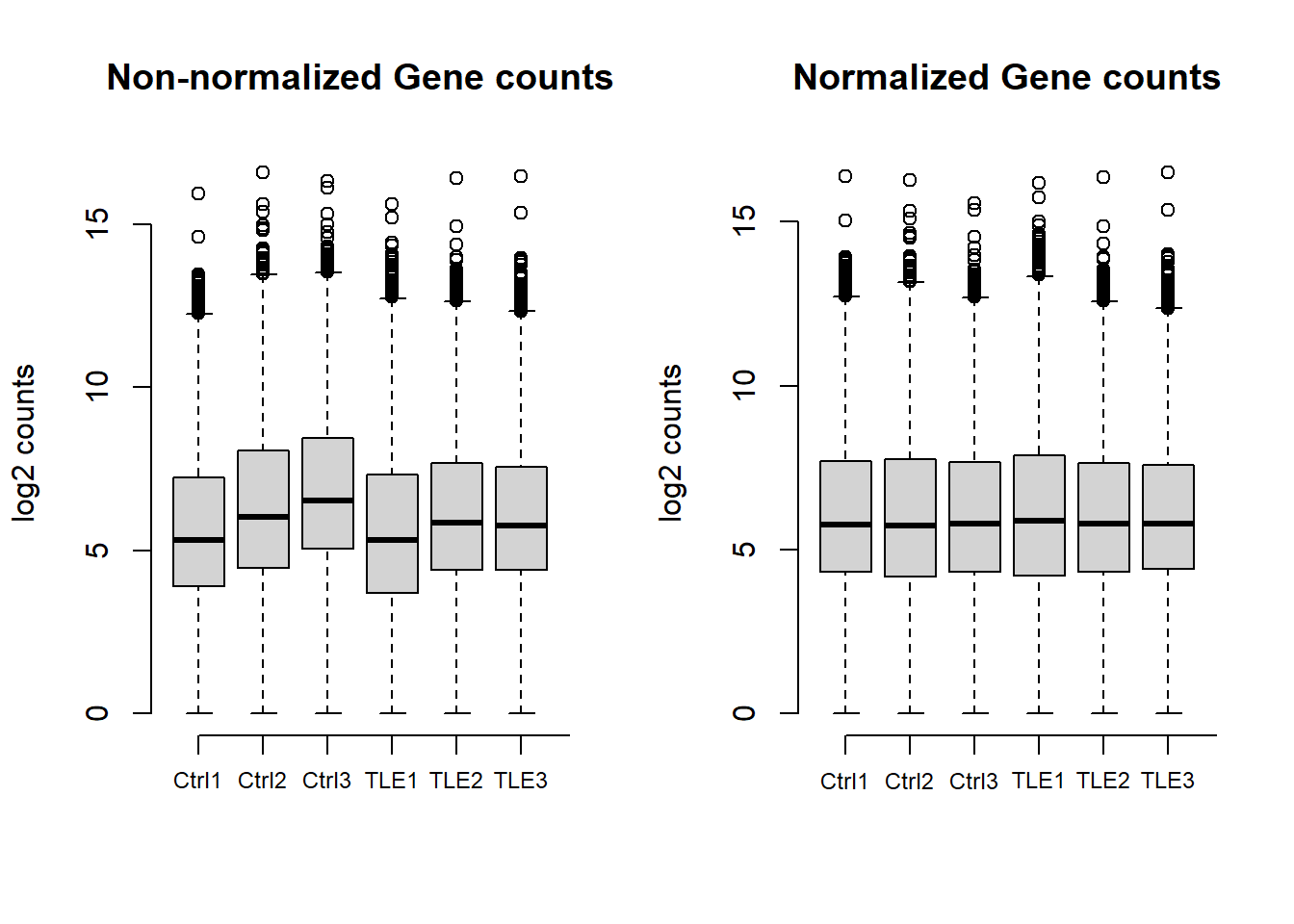
Plot dispersion estimates
A diagnostic plot of how well the data fits the model created by DESeq2 for differential expression testing. Good fit of the data to the model produces a scatter of points (black and blue) around the fitted curve (red). Low expressing genes, with counts below 10 reads across all samples, have been filtered out for computational efficiency.
Click to expand code
# Plot dispersion estimates, good fit of the data to the model produces a scatter of points around
# the fitted curve.
plotDispEsts(dds)
title("Dispersion estimates")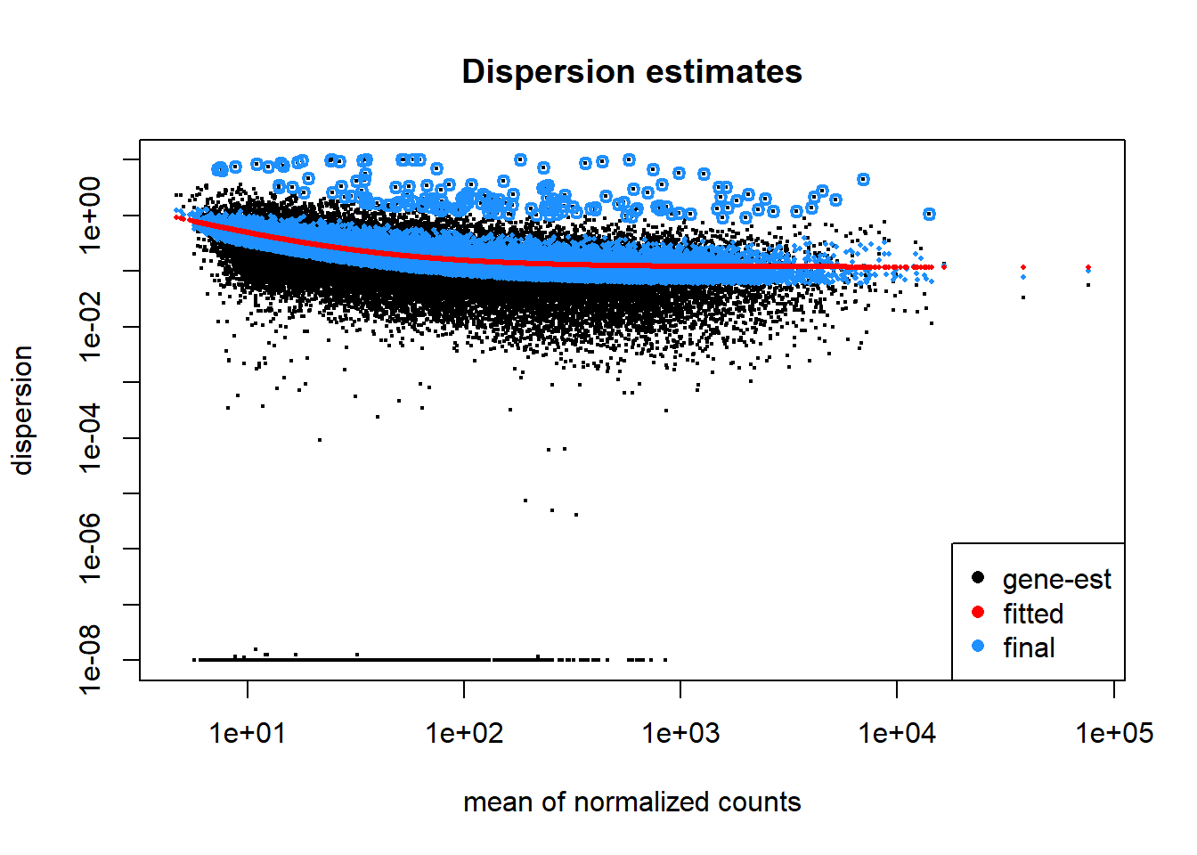
Dimensional reduction analyses
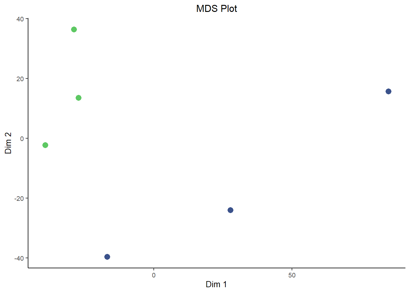
Principal Component Analysis (PCA) and Multidimensional Scaling (MDS) plots serve similar functions to each other and are interpretted in roughly the same way for our purposes here. PCA and MDS are dimensionality reduction techniques used in RNA-Seq analysis to visualize patterns of similarity or difference between samples. They transform high-dimensional gene expression data into a smaller number of dimensions, typically two. Thereby making it easier to detect clustering by condition, batch effects, or outliers. These plots provide an intuitive overview of global transcriptional variation across the dataset.
They differ in how they reduce dimensions. Critically, MDS is plotted in a way such that distances between samples are preserved as much as possible in the projection to lower dimensions. However, since MDS is based on preserving pair-wise distance you don’t natively get a measure of how much ‘information’ each dimension carries. That’s in contrast to the measure of variance explained by each dimension that you get out of PCA plots. In that way they both have benefits and are a good compliment to each other.
Click to expand code
plotPCA(rld, intgroup = "condition") + labs(title = "PCA Plot") + theme_bw() + scale_color_viridis_d(begin = 0.75,
    end = 0.25, direction = 1) + theme(text = element_text(size = 10), plot.title = element_text(hjust = 0.5),
    legend.position = "right", panel.border = element_blank(), panel.grid = element_blank(), axis.line = element_line("black"))
## using ntop=500 top features by variancesampleDists <- dist(t(assay(rld)))
sampleDistMatrix <- as.matrix(sampleDists)
mdsData <- data.frame(cmdscale(sampleDistMatrix))
mds <- cbind(mdsData, as.data.frame(colData(rld)))
ggplot(mds, aes(X1, X2, color = condition)) + geom_point(size = 3) + labs(title = "MDS Plot", x = "Dim 1",
y = "Dim 2") + theme_bw() + scale_color_viridis_d(begin = 0.75, end = 0.25, direction = 1) + theme(text = element_text(size = 10),
plot.title = element_text(hjust = 0.5), legend.position = "none", panel.border = element_blank(),
panel.grid = element_blank(), axis.line = element_line("black"))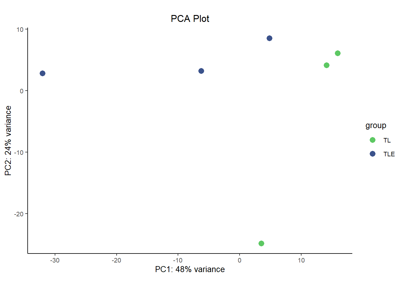
Up-regulated vs. Down-regulated genes
We can see here that there are roughly the same number of up-regulated as down regulated genes as was noted in the results summary and could be seen in the volcano plot. 758 are up-regulated, 818 are down-regulated.
Click to expand code
bar <- data.frame(direction = c("Down", "Up"), genes = c(length(which(res05$log2FoldChange < 0)), length(which(res05$log2FoldChange >
    0))))

# Create barplot
ggplot(bar, aes(x = direction, y = genes, fill = direction)) + geom_col(position = "stack", width = 0.25) +
    scale_fill_viridis(2, begin = 0.3, end = 0.7, direction = 1, discrete = TRUE) + labs(x = NULL, y = "Number of genes",
    fill = "Direction") + theme(legend.title = element_blank(), panel.grid.major = element_blank(), panel.background = element_blank(),
    legend.position = "none", axis.line = element_line(color = "black"), axis.ticks = element_line(color = "black"))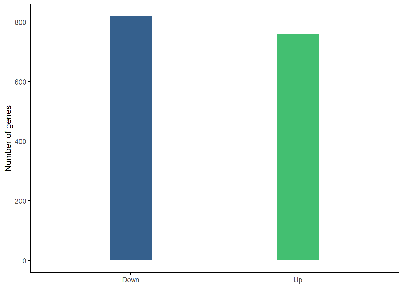
Gene Biotype treemap for all genes
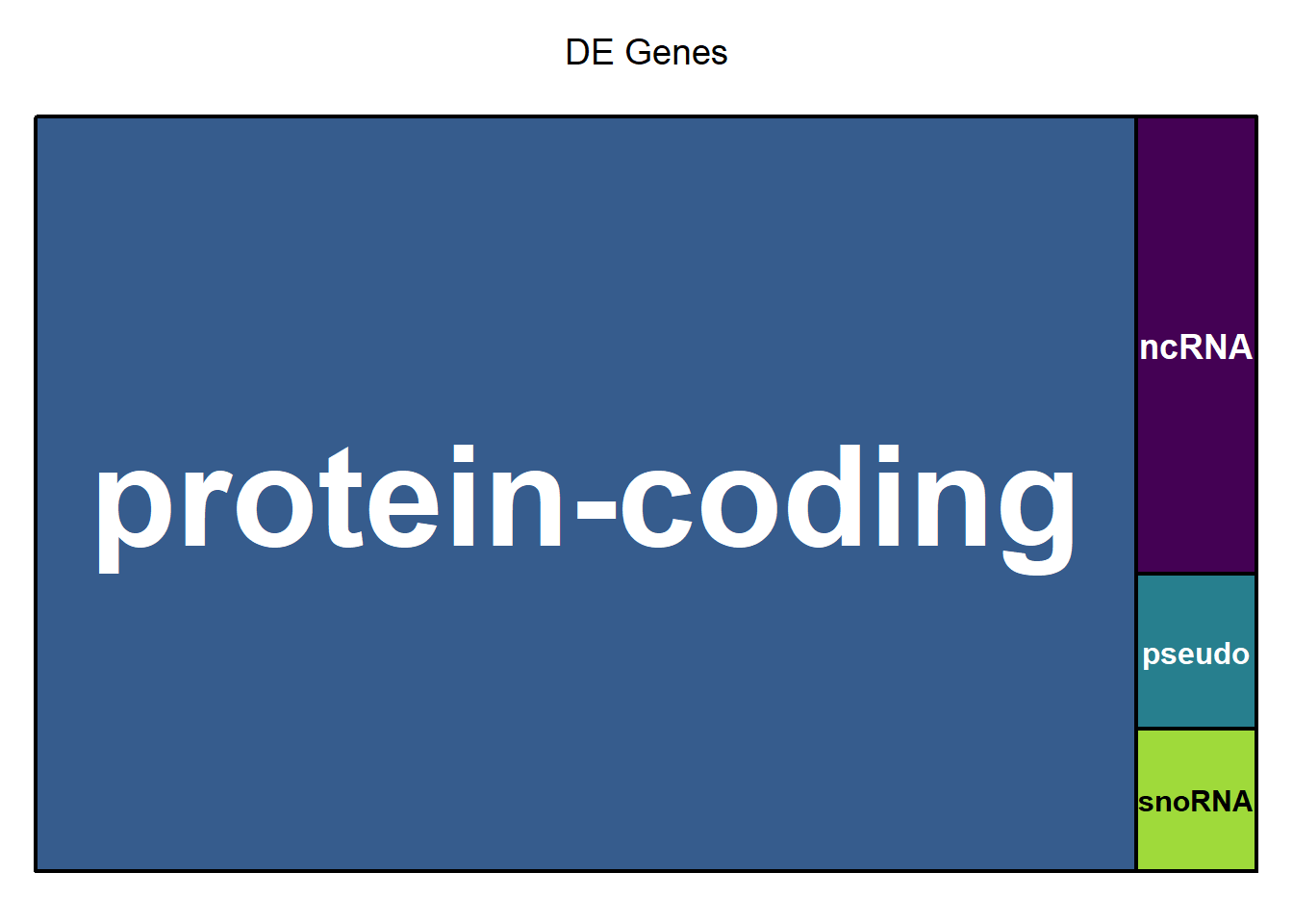
The treemap below shows the relative proportion of each gene biotype for all genes in the dataset. The area of the rectangle is proportional to the percentage of each biotype. The area of each of the rectangles is proportional to the percentage of each biotype when comparing Epilepsy and Control (ref.). The majority are protein coding which is normal, but protein coding genes make up a significantly higher proportion of differentially expressed genes (right figure).
Click to expand code
# Create treemap of gene biotypes for all genes.
biotype_all <- data.frame(table(mcols(dds)$GENETYPE))
biotype_all$Var1 <- gsub("_", " ", biotype_all$Var1)
biotype_all <- biotype_all[order(biotype_all$Freq, decreasing = TRUE), ]
# remove rows with 0 counts biotype_all <- biotype_all[biotype_all$Freq > 0, ]

# Create treemap of gene biotypes for differentially expressed genes.
resTable$GENETYPE <- as.factor(resTable$GENETYPE)
# levels(resTable$GENETYPE)
biotype_sig <- data.frame(table(resTable$GENETYPE[which(resTable$FDR < 0.05)]))
biotype_sig$Var1 <- gsub("_", " ", biotype_sig$Var1)
biotype_sig <- biotype_sig[order(biotype_sig$Freq, decreasing = TRUE), ]
# remove rows with 0 counts biotype_sig <- biotype_sig[biotype_sig$Freq > 0, ]

# Set up a custom layout layout(matrix(c(1, 2), nrow = 1, ncol = 2))

treemap(biotype_all, index = "Var1", vSize = "Freq", type = "index", palette = viridis(length(biotype_all$Var1)),
    aspRatio = 1.618/1, title = "All Genes", inflate.labels = TRUE, lowerbound.cex.labels = 0)

treemap(biotype_sig, index = "Var1", vSize = "Freq", type = "index", palette = viridis(length(biotype_sig$Var1)),
    aspRatio = 1.618/1, title = "DE Genes", inflate.labels = TRUE, lowerbound.cex.labels = 0)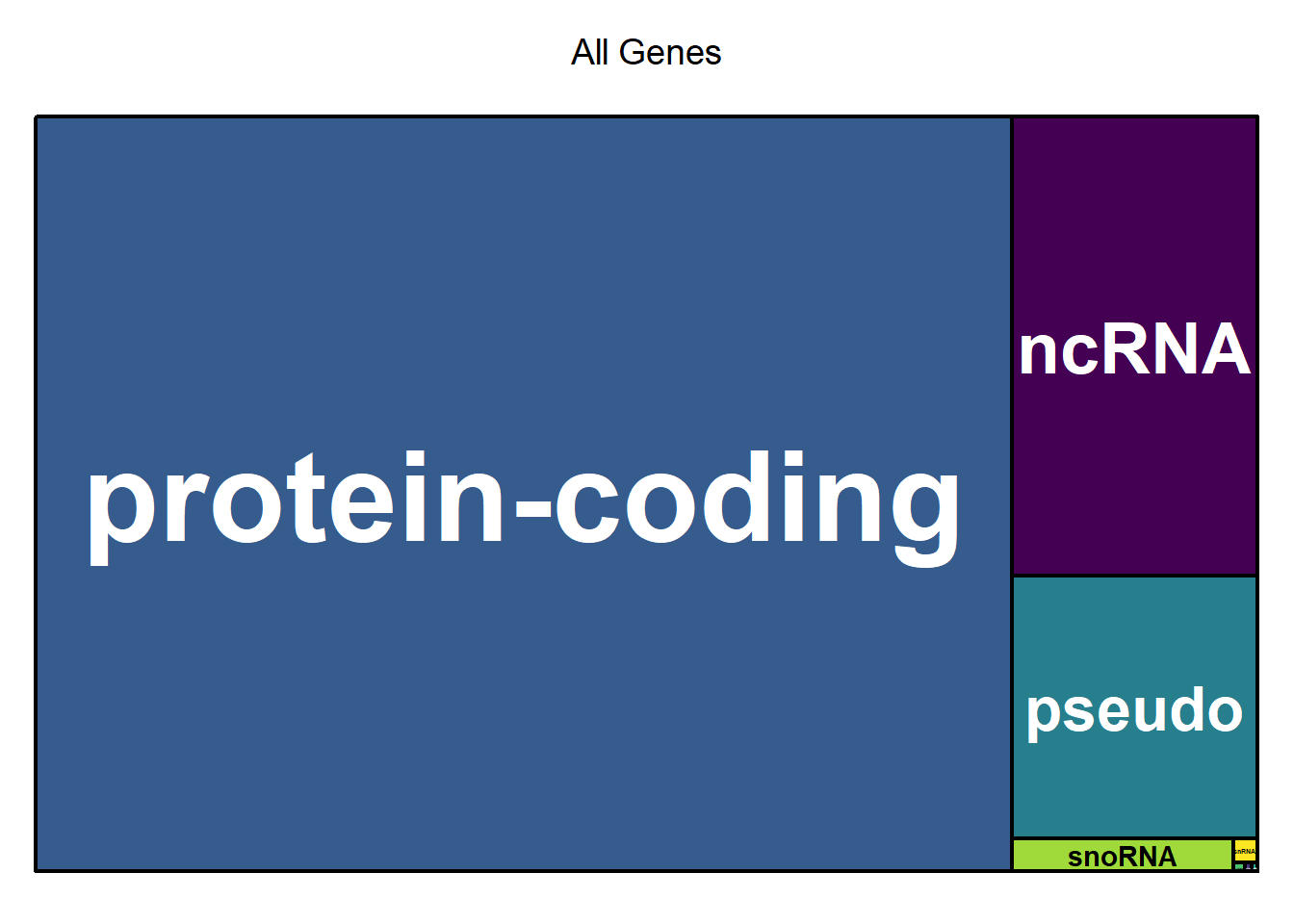
X2 Goodness of fit table
Click to expand code
biotype <- merge(biotype_all, biotype_sig, by = "Var1")
colnames(biotype) <- c("biotype", "AllGenes", "SigGenes")
biotype <- biotype[order(biotype$AllGenes, decreasing = TRUE), ]
# Combine rows with low counts into 'other' for the Chi-squared test.
biotype <- rbind(biotype, c("other", sum(biotype$AllGenes[4:8]), sum(biotype$SigGenes[4:8])))
biotype <- biotype[c(1:3, 9), ]
biotype$AllGenes <- as.integer(biotype$AllGenes)
biotype$SigGenes <- as.integer(biotype$SigGenes)
biotype$AllProp <- round(biotype$AllGenes/sum(biotype$AllGenes), digits = 3)
biotype$SigProp <- round(biotype$SigGenes/sum(biotype$SigGenes), digits = 3)
biotype <- biotype[, c(1, 2, 4, 3, 5)]
# biotype Perform Chi-Squared Goodness-of-Fit Test Compute total counts
total_all <- sum(biotype$AllGenes)  # Total genes
total_sig <- sum(biotype$SigGenes)  # Total significant genes

# Duplicate dataframe for table and rename columns for readability
biotable <- biotype
colnames(biotable) <- c("Biotype", "All Genes", "Proportion (All)", "Significant Genes", "Proportion (Sig.)")

# Compute expected counts under the null hypothesis
biotype$Expected <- total_sig * (biotype$AllGenes/total_all)
chi_sq_test <- chisq.test(biotype$SigGenes, p = biotype$AllGenes/total_all, rescale.p = TRUE)
# Print results print(chi_sq_test)

# Create the static table
biotable %>%
    kbl(format = "html", align = c("l", "r", "r", "r", "r"), row.names = FALSE, caption = paste0("Table 2: Proportion of each gene biotype when comparing ",
        status[2], " and ", status[1], " (ref.). The majority are protein-coding, which make up an even higher proportion of the significantly differentially expressed genes.")) %>%
    kable_styling(full_width = TRUE, bootstrap_options = c("striped", "hover", "condensed"), font_size = 13,
        position = "center") %>%
    column_spec(1, border_left = TRUE, border_right = TRUE) %>%
column_spec(2:5, width = "8em", border_left = TRUE, border_right = TRUE)| Biotype | All Genes | Proportion (All) | Significant Genes | Proportion (Sig.) |
|---|---|---|---|---|
| protein-coding | 14225 | 0.799 | 1160 | 0.901 |
| ncRNA | 2174 | 0.122 | 77 | 0.060 |
| pseudo | 1242 | 0.070 | 26 | 0.020 |
| other | 156 | 0.009 | 24 | 0.019 |
There is a statistically significant difference in the proportion of gene types when comparing the full dataset to the subset of differentially expressed genes (X2 = 117.371, df = 3, p-value = 2.842e-25).
Session info
Session Info provides details about the computational environment used for this analysis, including the versions of R, loaded packages, and system settings. This ensures that the analysis can be reproduced accurately in the future, even if software updates change how certain functions behave.
Click to expand code
sessionInfo()## R version 4.4.1 (2024-06-14 ucrt)
## Platform: x86_64-w64-mingw32/x64
## Running under: Windows 11 x64 (build 26100)
##
## Matrix products: default
##
##
## locale:
## [1] LC_COLLATE=English_United States.utf8
## [2] LC_CTYPE=English_United States.utf8
## [3] LC_MONETARY=English_United States.utf8
## [4] LC_NUMERIC=C
## [5] LC_TIME=English_United States.utf8
##
## time zone: America/Phoenix
## tzcode source: internal
##
## attached base packages:
## [1] grid stats4 stats graphics grDevices utils datasets
## [8] methods base
##
## other attached packages:
## [1] tibble_3.2.1 kableExtra_1.4.0
## [3] EnhancedVolcano_1.22.0 ggrepel_0.9.6
## [5] pheatmap_1.0.12 plotly_4.10.4
## [7] vsn_3.72.0 gridExtra_2.3
## [9] treemap_2.4-4 DESeq2_1.44.0
## [11] SummarizedExperiment_1.34.0 Biobase_2.64.0
## [13] MatrixGenerics_1.16.0 matrixStats_1.5.0
## [15] GenomicRanges_1.56.2 GenomeInfoDb_1.40.1
## [17] IRanges_2.38.1 S4Vectors_0.42.1
## [19] BiocGenerics_0.50.0 viridis_0.6.5
## [21] viridisLite_0.4.2 Glimma_2.14.0
## [23] limma_3.60.6 ggplot2_3.5.1
##
## loaded via a namespace (and not attached):
## [1] formatR_1.14 rlang_1.1.4 magrittr_2.0.3
## [4] gridBase_0.4-7 compiler_4.4.1 systemfonts_1.2.1
## [7] vctrs_0.6.5 stringr_1.5.1 pkgconfig_2.0.3
## [10] crayon_1.5.3 fastmap_1.2.0 XVector_0.44.0
## [13] labeling_0.4.3 promises_1.3.2 rmarkdown_2.29
## [16] UCSC.utils_1.0.0 preprocessCore_1.66.0 purrr_1.0.4
## [19] xfun_0.51 zlibbioc_1.50.0 cachem_1.1.0
## [22] jsonlite_1.8.8 later_1.4.1 DelayedArray_0.30.1
## [25] BiocParallel_1.38.0 irlba_2.3.5.1 parallel_4.4.1
## [28] R6_2.6.1 bslib_0.9.0 stringi_1.8.4
## [31] RColorBrewer_1.1-3 SQUAREM_2021.1 jquerylib_0.1.4
## [34] Rcpp_1.0.14 knitr_1.49 httpuv_1.6.15
## [37] Matrix_1.7-0 igraph_2.1.4 tidyselect_1.2.1
## [40] rstudioapi_0.17.1 abind_1.4-8 yaml_2.3.10
## [43] codetools_0.2-20 affy_1.82.0 lattice_0.22-6
## [46] shiny_1.10.0 withr_3.0.2 evaluate_1.0.3
## [49] xml2_1.3.6 pillar_1.10.1 affyio_1.74.0
## [52] BiocManager_1.30.25 generics_0.1.3 invgamma_1.1
## [55] truncnorm_1.0-9 munsell_0.5.1 scales_1.3.0
## [58] ashr_2.2-63 xtable_1.8-4 glue_1.7.0
## [61] lazyeval_0.2.2 tools_4.4.1 data.table_1.17.0
## [64] locfit_1.5-9.11 tidyr_1.3.1 crosstalk_1.2.1
## [67] edgeR_4.2.2 colorspace_2.1-1 GenomeInfoDbData_1.2.12
## [70] cli_3.6.3 mixsqp_0.3-54 S4Arrays_1.4.1
## [73] svglite_2.1.3 dplyr_1.1.4 gtable_0.3.6
## [76] sass_0.4.9 digest_0.6.36 SparseArray_1.4.8
## [79] farver_2.1.2 htmlwidgets_1.6.4 htmltools_0.5.8.1
## [82] lifecycle_1.0.4 httr_1.4.7 statmod_1.5.0
## [85] mime_0.12
Leave a comment