RNA Quest: Rethinking RNA-Seq reports through reanalysis of previously published neuronal transcriptomes
by Ryan Pevey
An interesting problem in Omics research
Click here to go to the dashboard only page.
I’ve noticed something when I work on big omics projects and I know that I’m not the first. Typically there are two teams of people on any given project, or more if it’s a multi-omics project. The bioinformaticists that are performing the statistical analysis, generating output results tables and figure creation (so many figures). As well as the biologists, who may have generated the biological samples that were processed, and will typically handle the downstream interpretation of the omics results and place them in a biological context. Often, but not always, there is a discrepancy between the background and training of these groups where the bioinformaticists tend to come from computer science, statistics or applied math fields. Of course many of them have coursework and training in biology, this isn’t an attack on bioinformaticists or the good work that they do, and it’s becoming more common that they have explicit training in biology or even a degree in biostatics or bioinformatics as these programs proliferate in academics. But few of them have much experience doing wet bench science like their collaborators. Also, many of them work on many projects within many biological models and contexts so they don’t always get the chance to dive deep into a single area of biology.
The opposite is normally true of the biologists on the project. Most of us are generalists in bench science with a single or a small handful of specialty bench skills, and a deep understanding of a typically very narrow field of biology. Few of us have any programming skills to speak of, nor training in how to understand the results of big data projects. Again, this isn’t meant to be an attack on biologists, just stating the reality of the differences in viewpoint and experience between the two groups of people.
This discrepancy in background leads to a second discrepancy. Where some of the people have deep intimate access to the data, and some of the people have a deep intimate knowledge of the biology underlying the data, and those typically are not the same people. This is the very nature of team based projects, but still, a gap in knowledge between groups can lead to a gap in communication between groups. This can have outsized impacts on the outcome of the project.
To put it another way, in large-scale Omics projects, a persistent challenge lies in bridging the communication gap between bioinformaticists who analyze the data and biologists who interpret it. While statistical outputs and processed data files contain a wealth of insight, they often lack the intuitive structure or clarity needed for effective biological interpretation. As a result, important findings may be overlooked or misinterpreted, underscoring the need for more accessible and integrative reporting strategies. I don’t think that this is an easy problem either or caused by a lack of effort. All of the people involved are highly intelligent and highly trained. I think this is just a function of the results being large and complex; and everybody has limited time and attention to give to it. Omics results are a firehose, and the person on the receiving end of it is normally only equipped with a bucket to catch as much water as they can.
It’s about the exploration, not just the destination
Some people, however, do have skills and expertise in both worlds. I sit at this nexus, with training and experience in bench science and bioinformatics. My degrees are in Biology and Neuroscience and I have over a decade of experience at the bench and the computer terminal (mainly RNA-Seq and scRNA-Seq). Those of us with these dual skills sets are in a relatively unique position where we can act as a liaison between the teams. We can discuss the minutiae of software choices and sharing analysis scripts with the one team, or the particulars of reagent selection and sharing bench protocols with the other team.
I’m proposing a pretty simple solution here for a hard problem, which is a report structure for Omics results that really facilitates the ability of biologists to explore the dataset in an interactive way. The report includes the core results figures and tables that typically are provided to collaborators, but in a single interactive web portal that acts as a clearinghouse for the results of the analysis. It’s the same results, but formatted in a way that really draws in the biologist for a more independent search of the dataset.
To that end I’ve created the below report on an analysis of RNA-Seq data that I performed at home as an example of the kind of reporting strategy that I think could facilitate this kind of exploration. I want to crack open the black box of omics methodologies for biologists so that you can see what is happening behind the scenes when you send samples off to the core for sequencing, or when you send an email to the bioinformaticists to ask for expression plots of a list of genes of interest. Now, they can just… look it up themselves. I believe this approach increases transparency and trust among collaborators, while increasing the biologists ability to engage with the data on a deeper level than is typically possible. Also, given the didactic focus of the forum here, I can afford to be more casual than in a traditional publication. So forgive me the informal tone of a lot of this page. If you’re a biologist, hopefully you come out of this exercise with a better appreciation for the work that the programmers do and a better understanding of how they produce their datasets and results files. There is a common misunderstanding in biology that “the computer does all the work”. Don’t be that person. This is a toy example with a small sample size and it still took me weeks of work. Hopefully this report highlights just how much effort goes into these kinds of analyses and the format presents a more intuitive way to understand those results.
If you are not a biologist, I think there is a relatively straightforward track that you can take to help bridge this gap that I’ve highlighted. I’m generally in favor of transparency in science, but I think the more you can facilitate your biologist collaborators to engage with the data and results that you’ve created the better. The standard output of results, like excel files and static figures showing top hits or general trends are great, I’m not saying you should stop providing a zip file of results. But I’ve seen many biologists excitedly receive their data from the core, only to be stuck in fear asking the question, “How am I supposed to make any conclusions from a 20,000 row excel file?”. Spending the time to make an engaging and visually appealing clearinghouse of results will also help them explore the data in a way that an excel file will just never provide, hopefully they even find it fun! Not to mention the polish and professional flair this kind of effort can lend to your output. Maybe this project can provide a better framework for reporting results to collaborators, I have a standalone html file (rnaQuest_DESeq.html) that could be provided to a biologist as an entry point to understanding the results, and just bundle it alongside the standard results files that you normally provide. That also provides privacy for unpublished data as nothing is hosted online, people can just download the html file locally and open it in the browser on their computer. If you decide to make the portal public later as part of the publication process, you’ve now just made a fancy web portal for anyone to explore your data with.
Maybe you’re new to RNA-Seq analysis and you’ve come across this post as you’re doing your first analysis. If that’s the case, I hope I can convince you early in your journey to develop good communication skills. As a data scientist, the results files and reports that you produce is your work product and the better you are at presenting them the more your collaborators will be able to mine from them. Omics datasets are a rich resource, but often they are not fully mined for data purely because of this gap in communication or limited time and resources. That’s a shame in my mind, because the amount of effort that goes into producing any one of these datasets can be enormous and there are over half of a million RNA-Seq datasets publicly available on NCBI resources (Zeimann, et al. 2019). The potential of this as a supply of data is immense and it grows every single day. Many groups always do a good job of all of this, but I think as a field we can do better on both sides. And everyone benefits from it.
Summary of dataset
This webpage reports the differential expression results of my re-analysis for this really nice RNA-Seq dataset from the neurons of patients with epilepsy (Pai et al., 2022). The original publication is mostly concerned with transcriptional alterations in glial cells but I’m electing to reanalyze their neuronal samples for a few reasons. First, to highlight the usefulness of previously published data. Second, so that I am not just retreading the same story over again. Third, and most selfishly, my experience lies mainly with neuronal datasets so I’m most familiar with this output. No offense to glia, they are great, but I’m really mostly focused on the reporting of results here!
The dataset consists of bulk RNA-Seq reads from three temporal lobe control post-mortem samples (TL), and three temporal lobe with epilepsy patient samples (TLE). In the original paper, four populations of cells were isolated from the samples via Fluorescence Activated Nuclei Sorting (FANS), one of those populations was the neurons and those are the samples that I’m working with here.
Differential expression analysis
Briefly, I started this project by downloading the fastq files for each sample from NCBI’s, Gene Expression Omnibus (GEO accession: GSE140393), then aligned the reads to the reference genome and produced a set of counts files which contain the number of reads counted for each genetic feature in the reference annotation (ensemble: GRCh38 release 113). Those counts files are the input files for this differential expression analysis. Which continues with loading all of the proper software and data files into R for processing with DESeq2.
All of the scripts for my full analysis pipeline, including downloading and preprocessing of the data before the differential expression analysis, are on my GitHub repository for this project here: RNA Quest at GitHub. If you’re not a programmer and you’ve ever been curious about the steps that go into the differential expression analysis, then click on the buttons labelled ‘Click to expand code’ and it will reveal the code that goes into each step. Just remember that this script is only the very last stage of the analysis. I’ve also included extensive comments in the code so hopefully you can understand something of it even if you have no programming experience. Note, the control is the reference group, that’s hopefully obvious but I want to be explicit about it. All statistical analysis results are epileptic neurons referenced in comparison to the neurons of control patients.
Click to expand code
library(ggplot2)
library(limma)
library(Glimma)
library(viridis)
# library(AnnotationDbi)
# library(org.Hs.eg.db)
library(DESeq2)
library(treemap)
library(gridExtra)
library(grid)
library(vsn)
library(plotly)
library(pheatmap)
library(EnhancedVolcano)
# library(htmlwidgets)
library(kableExtra)
library(tibble)

###Read in datasets
#Import read count matrix
dat <- read.delim('../../data/merged.tsv', header = TRUE, sep="\t", check.names = FALSE)

#Remove special tagged rows, the first four, from the head of dat.
dat <- dat[5:length(dat[,1]),]
#Extract Ensembl ID and gene symbols
geneID <- as.data.frame(cbind(rownames(dat), dat$gene_symbols))
colnames(geneID) <- c('EnsID', 'gene_symbols')
dat <- dat[,2:7]

#Import sample metadata.
metadata <- read.delim('../../data/SraRunMetadata.csv', header=TRUE, sep=",")

#Metadata condition as factor
metadata$condition <- factor(metadata$condition)
levels(metadata$condition) <- c('TL','TLE')
metadata$ID <- c('Ctrl1', 'Ctrl2', 'Ctrl3', 'TLE1', 'TLE2', 'TLE3')

#Create sample information table
coldata <- metadata[,c('ID','condition', 'Run')]
rownames(coldata) <- metadata$ID
#Assign row names of coldata to column names of dat
colnames(dat) <- rownames(coldata)

#Import results tables
resTable <- read.csv(paste0('../../results/','TL_TLE_allGenes_DEresults.csv'), header=TRUE)

###Create differential expression object
#This block of code is not executed, but is the code of how the DESeq object (dds) was created.
#Create sample information table
# coldata <- metadata[,c('condition','ID','Run')]
# rownames(coldata) <- metadata$SampleID
# colnames(dat) #<- metadata$SampleID

#Create DESeqDataSet object
# dds <- DESeqDataSetFromMatrix(countData = dat,
#                               colData = coldata,
#                               design = ~ condition)
# dds

#Pre-filter low count genes
#Smallest group size is the number of samples in each group (3 in this dataset).
# smallestGroupSize <- 3
# keep <- rowSums(counts(dds) >= 10) >= smallestGroupSize
# dds <- dds[keep,]

#Differential expression analysis
# dds <- DESeq(dds)
#Remove nonconverged genes
# dds <- dds[which(mcols(dds)$betaConv),]

#Load RDS files for following code chunk
dds <- readRDS('../../bin/dds_DE_TL-TLE.rds')

#Build results table
#Set contrast groups, reference level should be listed last.
contrast <- c('condition', 'TLE', 'TL')
res <- results(dds,
               contrast = contrast,
               alpha = 0.05,
               pAdjustMethod = 'BH')

#Create significant results table ordered by fold change
res05 <- res[which(res$padj < 0.05),]
res05 <- res05[order(-res05$log2FoldChange),]

#Create condition labels for report titles
status <- c('Control', 'Epilepsy')
Temporal lobe neurons of Epilepsy patients (TLE) vs. Temporal lobe neurons of Control post-mortem tissue (ref.) differential expression analysis results
Alright, the meat of the report, the results. Keep in mind that there is a fair amount of exploratory analysis and quality control that goes into the analysis at this stage to ensure that the data is processed properly (e.g. normalization, regularization). Those steps were performed here but are presented further down the page so that we can jump right to the exciting part: the results.
There are 1576 significant differentially expressed genes (FDR < 0.05) when comparing Epilepsy to Control as reference. 758 are up-regulated, 818 are down-regulated. The results of the DE analysis are summarized in the table below. Overall, roughly the same number of genes(~3%) are down-regulated compared to up-regulated genes.
Summary of results
Click to expand code
summary(res)
## out of 26557 with nonzero total read count
## adjusted p-value < 0.05
## LFC > 0 (up)       : 758, 2.9%
## LFC < 0 (down)     : 818, 3.1%
## outliers [1]       : 36, 0.14%
## low counts [2]     : 7209, 27%
## (mean count < 22)
Gene expression dashboard
I’ve made this interactive gene expression dashboard below to help you explore the dataset. Mouse over the genes on the volcano plot to explore the highlighted significant genes. If you want to see the expression profile for that specific gene then enter it, or your favorite gene, into the gene expression plot on the right. If the gene is statistically significant, than an FDR value and bracket indicating significance are automatically populated. If not then the words “No DE result” will appear instead. If you want to restrict the gene expression plot to only display significant genes than toggle the checkbox beneath the plot. You can see the data used to create the plot with the table beneath it or download it by clicking the download graph data button to capture it as a csv.
I have the gene expression plot hosted by a Render server then piped into this page through an iframe. So if the plot isn’t loading correctly, it has probably just gone inactive and you can find it here (Gene Expression Dashboard). Actually, if you visit there then first or just reload this page, it should reactivate and load correctly.
Volcano plot
Explore Gene Expression Interactively
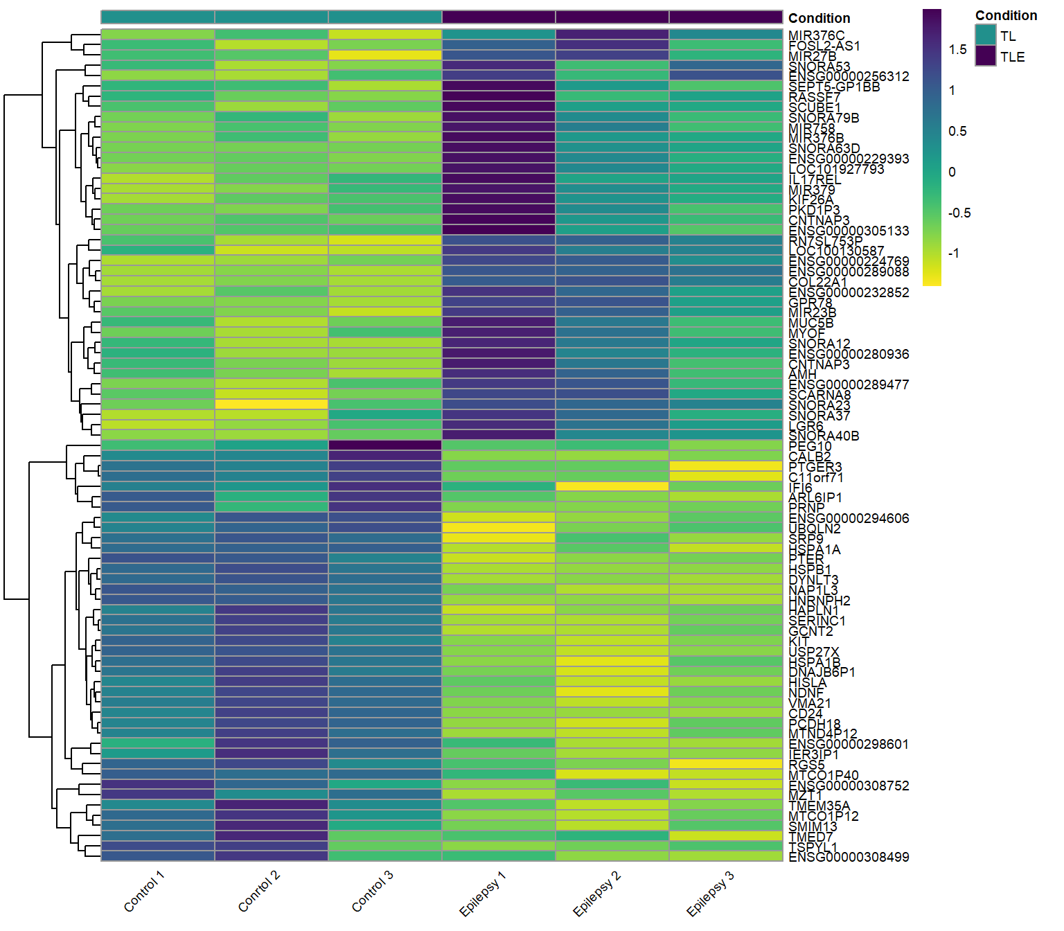
Heatmap
Heatmaps provide a visual representation of gene expression across multiple samples, using color gradients to indicate expression levels. Clustering patterns can reveal relationships between genes and conditions, helping to identify co-regulated genes and distinct expression profiles. The most down-regulated genes in epilepsy patient samples all cluster in the top half of this heatmap together, these genes correspond to the left side of the volcano plot above. Conversely, the most up-regulated genes in the neurons of epilepsy patients cluster to the bottom of the heatmap and show up on the right side of the volcano plot.
Up-regulated and Down-regulated genes: Epilepsy vs. Control (ref.)
Both the top up-regulated and down-regulated genes in the neurons of epilepsy patients.
Results table: Epilepsy vs. Control (ref.)
Click to expand code
# Add significant column. If the FDR is NA or higher than 0.05, than 'No'.
resTable$Significant <- ifelse(is.na(resTable$FDR) | resTable$FDR >= 0.05, "No", "Yes")
datTable <- cbind(resTable[, 2:7], resTable[, 16], resTable[, 9], resTable[, 11:14])
datTable[, 2:4] <- round(datTable[, 2:4], digits = 3)
datTable$pvalue <- formatC(datTable$pvalue, format = "e", digits = 2)
datTable$FDR <- formatC(datTable$FDR, format = "e", digits = 2)
datTable <- datTable[order(datTable$log2FoldChange, decreasing = TRUE), ]
# Reset the index to that row numbers match the order of the table.
rownames(datTable) <- NULL
colnames(datTable) <- c("Gene", "Base Mean", "log2FC", "LFC SE", "p-value", "FDR", "Significant?", "Ensembl ID",
    "Symbol", "MAP locus", "Gene type", "Gene description")
write.csv(datTable, file = "../../results/resTable1.csv", row.names = FALSE)
# resTable1.csv hosted on github and embedded as an iframe below. Import datTable datTable <-
# read.csv(paste0('../../results/','resTable1.csv'), header=TRUE)
Table 1: These are the results of the differential expression analysis when comparing Epilepsy and Control (ref.) neurons. The columns are ordered by log2FoldChange with up-regulated genes at the top and down-regulated genes at the bottom. Numeric values listed to 3 significant digits. An FDR is not calculated for non-significant results. You can search for a gene of interest by Ensembl ID or gene name using the search box at the top.
Gene expression plots
These are the exact same type of plot as the right side of the dashboard above, except these are static instead of interactive. Gene expression plots visualize how a gene’s expression varies across conditions or samples, helping identify trends, variability, and potential differential expression. Higher expression levels indicate greater transcript abundance, while statistical comparisons (e.g., boxplots, dot plots) help assess significance between groups.
Let’s take a moment to discuss interpretting these figures. It’s important to interpret these boxplots carefully, especially with the small sample size here. The boxplot includes an in-built outlier test where any point that is more than 1.5x the interquartile range (IQR, the top and bottom of the box) above or below the median value will be plotted as an individual datapoint outside of the range of the “whiskers”. Generally, it would be preferrable to have a larger sample size than 3 for each group, but sometimes you have to work with what samples you have access to and this post is for educational purposes remember.
Interesting genes: Epilepsy vs. Control (ref.)
Click to expand code
# Plot counts: highest foldChange gene
ens <- rownames(res)[which.max(res$log2FoldChange)]
plt <- plotCounts(dds, gene = ens, intgroup = "condition", normalized = TRUE, transform = TRUE, returnData = TRUE)
y_max <- max(plt$count, na.rm = TRUE)
padj_value <- format(res[ens, "FDR"], digits = 3)
levels(plt$condition) <- c("Control", "Epilepsy")

p <- ggplot(plt, aes(x = condition, y = count, color = condition)) + geom_boxplot(color = "black", outlier.shape = NA, width = 0.5) + geom_point(cex = 3, position = position_jitter(w = 0.1, h = 0)) + scale_color_viridis_d(begin = 0.75,
    end = 0.25, direction = 1) + labs(title = NULL, y = "Counts", x = "Condition") + theme_bw() + theme(text = element_text(size = 10), plot.title = element_text(hjust = 0.5), legend.position = "none",
    panel.border = element_blank(), panel.grid = element_blank(), axis.line = element_line("black"), axis.text.x = element_text(angle = 45, hjust = 1)) + scale_y_log10() + annotate("text", x = 1.5, y = y_max *
    3, label = ens) + annotate("text", x = 1.5, y = y_max * 1.5, label = paste("FDR =", padj_value)) + annotate("segment", x = 1, xend = 2, y = y_max * 1.3, yend = y_max * 1.3) + annotate("segment", x = 1,
    xend = 1, y = y_max * 1.3, yend = y_max * 1.2) + annotate("segment", x = 2, xend = 2, y = y_max * 1.3, yend = y_max * 1.2)

# Plot counts: gene of interest up-regulated
geneOfInt <- "LGR6"
ens <- geneOfInt
plt <- plotCounts(dds, gene = geneOfInt, intgroup = "condition", normalized = TRUE, transform = TRUE, returnData = TRUE)
y_max <- max(plt$count, na.rm = TRUE)
padj_value <- format(res[ens, "FDR"], digits = 3)
levels(plt$condition) <- c("Control", "Epilepsy")

q <- ggplot(plt, aes(x = condition, y = count, color = condition)) + geom_boxplot(color = "black", outlier.shape = NA, width = 0.25) + geom_point(cex = 3, position = position_jitter(w = 0.1, h = 0)) +
    scale_color_viridis_d(begin = 0.75, end = 0.25, direction = 1) + labs(title = NULL, y = "Counts", x = "Condition") + theme_bw() + theme(text = element_text(size = 10), plot.title = element_text(hjust = 0.5),
    legend.position = "none", panel.border = element_blank(), panel.grid = element_blank(), axis.line = element_line("black"), axis.text.x = element_text(angle = 45, hjust = 1)) + scale_y_log10() + annotate("text",
    x = 1.5, y = y_max * 3, label = ens) + annotate("text", x = 1.5, y = y_max * 1.5, label = paste("FDR =", padj_value)) + annotate("segment", x = 1, xend = 2, y = y_max * 1.3, yend = y_max * 1.3) + annotate("segment",
    x = 1, xend = 1, y = y_max * 1.3, yend = y_max * 1.2) + annotate("segment", x = 2, xend = 2, y = y_max * 1.3, yend = y_max * 1.2)

# Plot counts: gene of interest down-regulated
geneOfInt <- "CALB2"
ens <- geneOfInt
plt <- plotCounts(dds, gene = ens, intgroup = "condition", normalized = TRUE, transform = TRUE, returnData = TRUE)
y_max <- max(plt$count, na.rm = TRUE)
padj_value <- format(res[ens, "FDR"], digits = 3)
levels(plt$condition) <- c("Control", "Epilepsy")

r <- ggplot(plt, aes(x = condition, y = count, color = condition)) + geom_boxplot(color = "black", outlier.shape = NA, width = 0.25) + geom_point(cex = 3, position = position_jitter(w = 0.1, h = 0)) +
    scale_color_viridis_d(begin = 0.75, end = 0.25, direction = 1) + labs(title = NULL, y = "Counts", x = "Condition") + theme_bw() + theme(text = element_text(size = 10), plot.title = element_text(hjust = 0.5),
    legend.position = "none", panel.border = element_blank(), panel.grid = element_blank(), axis.line = element_line("black"), axis.text.x = element_text(angle = 45, hjust = 1)) + scale_y_log10() + annotate("text",
    x = 1.5, y = y_max * 3, label = ens) + annotate("text", x = 1.5, y = y_max * 1.5, label = paste("FDR =", padj_value)) + annotate("segment", x = 1, xend = 2, y = y_max * 1.3, yend = y_max * 1.3) + annotate("segment",
    x = 1, xend = 1, y = y_max * 1.3, yend = y_max * 1.2) + annotate("segment", x = 2, xend = 2, y = y_max * 1.3, yend = y_max * 1.2)

# Plot counts: lowest foldChange gene
ens <- rownames(res)[which.min(res$log2FoldChange)]
plt <- plotCounts(dds, gene = ens, intgroup = "condition", normalized = TRUE, transform = TRUE, returnData = TRUE)
y_max <- max(plt$count, na.rm = TRUE)
padj_value <- format(res[ens, "FDR"], digits = 3)
levels(plt$condition) <- c("Control", "Epilepsy")

s <- ggplot(plt, aes(x = condition, y = count, color = condition)) + geom_boxplot(color = "black", outlier.shape = NA, width = 0.25) + geom_point(cex = 3, position = position_jitter(w = 0.1, h = 0)) +
    scale_color_viridis_d(begin = 0.75, end = 0.25, direction = 1) + labs(title = NULL, y = "Counts", x = "Condition") + theme_bw() + theme(text = element_text(size = 10), plot.title = element_text(hjust = 0.5),
    legend.position = "none", panel.border = element_blank(), panel.grid = element_blank(), axis.line = element_line("black"), axis.text.x = element_text(angle = 45, hjust = 1)) + scale_y_log10() + annotate("text",
    x = 1.5, y = y_max * 3, label = ens) + annotate("text", x = 1.5, y = y_max * 1.5, label = paste("FDR =", padj_value)) + annotate("segment", x = 1, xend = 2, y = y_max * 1.3, yend = y_max * 1.3) + annotate("segment",
    x = 1, xend = 1, y = y_max * 1.3, yend = y_max * 1.2) + annotate("segment", x = 2, xend = 2, y = y_max * 1.3, yend = y_max * 1.2)

subplot(ggplotly(s), ggplotly(r), ggplotly(q), ggplotly(p), nrows = 1, margin = 0.01, widths = c(0.25, 0.25, 0.25, 0.25))
Most down-regulated gene: ARL6IP1. This gene has known functions in ER and Mitochondrial organelle homeostasis (Foronda et. al., 2023), and specifically in neurons it is a modulator of glutamate transport (Akiduki, 2008). As the most down-regulated gene in the dataset is such an important gene for excitatory neuron function, it’s safe to say that these neurons are not doing great.
Gene of interest down-regulated: CALB2. The CALB2 gene (Calbindin 2), encoding the calcium-binding protein Calretinin, plays critical roles in neuronal excitability (Camp and Wijesinghe, 2009). Abundant in hippocampus, amygdala, and cerebral cortex, with modified expression linked to temporal lobe epilepsy (Dixit et. al., 2015).
Gene of interest up-regulated: LGR6. Is a Wnt-signaling associated stem cell marker with links to cancer (Huang et. al., 2017). Generally it is not associated with expression in neurons and has very low expression in our control neurons, but sees a huge increase in epilepsy patient neurons in this dataset.
Most up-regulated gene: MIR376C. Is a microRNA involved in post-transcriptional gene regulation normally associated with roles in development (Fu et. al., 2013) and homeostasis through interacting with SOX6-mediated Wnt signaling (Cao et. al., 2021). So, we’re already seeing Wnt signaling showing up as a potential dysregulated pathway.
Discussion
Congrats programmers, you can now hand your report off to collaborators! I’m not going to do a full in-depth review of the results here. The point of this post is to highlight how this interactive report format can facilitate a deeper more intuitive exploration of the dataset than scrolling static excel files. Having said that! We can see some trends that jump right out at us. SNORA genes, are small non-coding nucleolar RNAs that are generally associated with RNA regulation (Huang et. al., 2022) and cellular stress response (Cheng et. al., 2024). Indicating a big increase in transcriptomic dysregulation and cellular stress in neurons. Our Wnt signaling associated genes are a pretty interesting hit. A cursory submission of the results into GOrilla (results not presented here) reveal similarities to the enrichment analysis results in the original paper. Up-regulated results: Semaphorin-Plexin signaling pathway, gene expression regulation, lipid metabolism pathways. My analysis seems to show a bigger inclusion of RNA metabolism than their analysis did. Down-regulated results: Protein transport, cellular secretion, GABAergic synaptic transmission, axon formation. What is clear, is that there are a lot of results to dig through here. Happy hunting!
Methods
I am performing a reanalysis of previously published data (Pai et al., 2022). Their study, briefly, collected temporal lobe tissue from patients with medically refractory epilepsy and control donors, preparing samples for immunofluorescence, single-cell dissociation, or Fluorescence-Activated Nuclei Sorting (FANS). Using an enhanced FANS protocol, they isolated nuclei from NEUN+, OLIG2+, and PAX6+ populations and preserved RNA from sorted nuclei for downstream analysis. Total nuclear RNA was extracted, depleted of rRNA, and used to generate libraries for paired-end sequencing on an Illumina HiSeq 2500 (50 bp pair-end sequencing, 38–50 million paired-end reads/sample). They uploaded their data as fastq files to NCBI’s Gene Expression Omnibus (GEO accession: GSE140393), which is were I accessed the data on 3rd, March 2025. Sequencing reads were aligned to the human genome (ensemble: GRCh38 release 113) using STAR with default settings, and quantified gene-level expression using STAR’s ‘–quantMode GeneCounts’ option. Sorted Bam files were produced with Samtools.
Scripts
This is the R script that I used for this analysis, it has been ported into this report file. The following code is not executed, but is presented for transparency and reproducibility. Again, this is only the script that I used for the differential expression analysis. If you want all of the scripts for the full analysis including the downloading and preprocessing of the data before the differential expression, you can find it on my github repository for this project here: RNA Quest at GitHub.
Click to expand code
#This script performs differential expression analysis on the Pai et al. dataset (DOI: 10.1186/s40478-022-01453-1) using DESeq2.

library(ggplot2)
library(limma)
library(Glimma)
library(viridis)
library(AnnotationDbi)
library(org.Hs.eg.db)
library(DESeq2)
library(tidyverse)
library(treemap)
library(vsn)
library(plotly)
library(pheatmap)
library(EnhancedVolcano)
library(htmlwidgets)

#####################
###Data Management###
#####################

###Import read count matrix for TLE study
setwd(rstudioapi::selectDirectory(caption = "Select Project Directory"))
dat <- read.delim('data/merged.tsv', header = TRUE, sep="\t", check.names = FALSE)
dat[1:6,1:6]

#Remove special tagged rows, the first four, from the head of dat.
length(dat[,1])
head(dat)[,1:3]
dat <- dat[5:length(dat[,1]),]
head(dat)[,1:3]
length(dat[,1])
#Extract Ensembl ID and gene symbols
geneID <- as.data.frame(cbind(rownames(dat), dat$gene_symbols))
colnames(geneID) <- c('EnsID', 'gene_symbols')
head(geneID)
dat <- dat[,2:7]
head(dat)

#Import sample metadata.
metadata <- read.delim('data/SraRunMetadata.csv', header=TRUE, sep=",")
head(metadata)

#Metadata condition as factor
metadata$condition <- factor(metadata$condition)
levels(metadata$condition) <- c('TL','TLE')
metadata$ID <- c('Ctrl1', 'Ctrl2', 'Ctrl3', 'TLE1', 'TLE2', 'TLE3')

#Create sample information table
coldata <- metadata[,c('ID','condition', 'Run')]
rownames(coldata) <- metadata$ID
coldata
#Assign row names of coldata to column names of dat
colnames(dat) <- rownames(coldata)
head(dat)


#######################
###DESeq DE analysis###
#######################

#Create DESeqDataSet object
dds <- DESeqDataSetFromMatrix(countData = dat,
                              colData = coldata,
                              design = ~ condition)
dds

#Replace Ensembl ID with gene symbol were available
IDs <- rownames(dds)
head(IDs)
head(geneID)
colnames(geneID)[1:2] <- c('ensemblID', 'geneID')
#check that IDs and geneID match each other
all(IDs == geneID$ensemblID)
length(which(IDs!=geneID$ensemblID))
length(IDs)
length(geneID$ensemblID)
tail(IDs)
tail(geneID$ensemblID)
#Create a new gene feature column that uses gene symbol, if available, and Ensembl ID otherwise.
geneID$geneNew <- ifelse(is.na(geneID$geneID),
                         geneID$ensemblID,
                         geneID$geneID)

#Check that geneNew shows desired output for missing gene symbols
head(geneID)
#Spot check random IDs and ensemblIDs for sanity check
rndm <- round(runif(10, min = 0, max = length(IDs)), digits = 0)
IDs[rndm]
geneID[rndm,]

#Add gene annotations
gene_info <- AnnotationDbi::select(org.Hs.eg.db,
                    keys = geneID$ensemblID,
                    columns = c("SYMBOL", "MAP", "GENETYPE", "GENENAME"),
                    keytype = "ENSEMBL")
head(gene_info)
#return only unique mappings
gene_info <- gene_info[isUnique(gene_info$ENSEMBL),]
#geneID and gene_info do not match yet
all(geneID$ensemblID == gene_info$ENSEMBL)
gene_info <- merge(geneID, gene_info,
                   by.x = "ensemblID",  # Column in colData to match
                   by.y = "ENSEMBL",    # Column in gene_info to match
                   all.x = TRUE)  # Keep all colData rows
# Restore original order of colData
gene_info <- gene_info[match(geneID$ensemblID, gene_info$ensemblID), ]
#Now they do match!
all(geneID$ensemblID == gene_info$ENSEMBL)
head(geneID)
head(gene_info)

#Add geneID to dds metadata
mcols(dds) <- cbind(mcols(dds), gene_info)
rownames(dds) <- geneID$geneNew

#Pre-filter low count genes
#Smallest group size is the number of samples in each group (3 in this ).
smallestGroupSize <- 3
keep <- rowSums(counts(dds) >= 10) >= smallestGroupSize
dds <- dds[keep,]

#Confirm factor levels
dds$ID
dds$condition
dds$Run
# mcols(dds)$MAP

#Differential expression analysis
dds <- DESeq(dds)
#Remove nonconverged genes
dds <- dds[which(mcols(dds)$betaConv),]
boxplot(log2(counts(dds, normalized = TRUE)+1), axes = FALSE, ylab = 'log2 counts')
axis(1, labels = FALSE, at = c(seq(1,40,1)))
axis(2, labels = TRUE)
text(x = seq_along(colnames(dds)), y = -2, labels = colnames(dds),
     # srt = 45,    #rotate
     adj = 0.5,    #justify
     xpd = TRUE, #print outside of plot area
     cex = 0.75)  #smaller font size

#Plot dispersion estimates
plotDispEsts(dds)

#Save an rds file to start the script here
# saveRDS(dds, 'bin/dds_DE_TL-TLE.rds')
# dds <- readRDS('bin/dds_DE_TL-TLE.rds')


#########################
###Build results table###
#########################

levels(dds$condition)
#Set contrast groups, reference level should be listed last.
contrast <- c('condition', 'TLE', 'TL')
res <- results(dds,
               contrast = contrast,
               alpha = 0.1,
               pAdjustMethod = 'BH')
res
summary(res)

#How many adjusted p-values are less than 0.1?
sum(res$padj < 0.1, na.rm=TRUE)
table(res$padj < 0.1)
#Create significant results table ordered by fold change
res10 <- res[which(res$padj < 0.1),]
res10 <- res10[order(-res10$log2FoldChange),]
#How many adjusted p-values are less than 0.05?
sum(res$padj < 0.05, na.rm=TRUE)
table(res$padj < 0.05)

#How many up-regulated (FDR < 0.1)
length(which(res10$log2FoldChange > 0))
#How many down-regulated (FDR < 0.1)
length(which(res10$log2FoldChange < 0))
bar <- data.frame(direction = c('up','down'), genes = c(length(which(res10$log2FoldChange > 0)),length(which(res10$log2FoldChange < 0))))
bar

#Log fold change shrinkage for visualization and ranking, especially since we only have 3 samples per group
plotMA(res, ylim=c(-3,3))
resultsNames(dds)
resLFC <- lfcShrink(dds, contrast = contrast, type = 'ashr')
resLFC
plotMA(resLFC, ylim=c(-3,3))
res <- resLFC

#Add geneID variables
res$geneNew <- row.names(res)
res_annotated <- merge(as.data.frame(res), gene_info, by="geneNew", all.x=TRUE)
head(mcols(dds)[3])
head(res_annotated)

#Write out results table
#Reorder columns and order results table by smallest p-value
colnames(res_annotated)[1] <- 'gene'
colnames(res_annotated)[6] <- 'FDR'
res_annotated <- res_annotated[order(res_annotated$FDR),]
head(res_annotated)
# write.csv(as.data.frame(res_annotated), file=paste0('results/','TL','_','TLE','_allGenes_DEresults.csv'), row.names = TRUE)

#Glimma MD plot
res.df <- as.data.frame(res_annotated)
res.df$log10MeanNormCount <- log10(res.df$baseMean)
idx <- rowSums(counts(dds)) > 0
res.df <- res.df[idx,]
res.df$FDR[is.na(res.df$FDR)] <- 1
res.df <- res.df[isUnique(res.df$gene),]
exm <- res.df[,c(1:6,13)]
rownames(exm) <- exm$gene
anno <- res.df[,c(1,7:12)]
rownames(anno) <- anno$gene
# color_vector <- viridis(100)[cut(exm$FDR, breaks=100)]
# de_colors <- setNames(viridis(3), c('DE', 'Not Sig', 'Not DE'))
de_colors <- viridis(3)
status <- ifelse(exm$FDR < 0.05 & abs(exm$log2FoldChange) > 1, 'DE',
                 ifelse(exm$FDR > 0.05 & abs(exm$log2FoldChange) < 1, 'Not Sig', 'Not DE'))

glMDPlot(exm,
         xval = 'log10MeanNormCount',
         yval = 'log2FoldChange',
         anno = anno,
         groups = dds$condition,
         # cols = de_colors,
         cols = c('#BEBEBEFF', '#440154FF', '#21908CFF'),
         status = status,
         samples = colnames(dds)
)


#########
###EDA###
#########

#Create treemap of gene biotypes for all genes
biotype_all <- data.frame(table(mcols(dds)$GENETYPE))
biotype_all$Var1 <- gsub('_',' ',biotype_all$Var1)
biotype_all <- biotype_all[order(biotype_all$Freq, decreasing = TRUE),]
# png(filename='results/figs/tree.png',width=800, height=1295)
treemap(biotype_all,
        index = 'Var1',
        vSize = 'Freq',
        type = 'index',
        palette = viridis(length(biotype_all$Var1)),
        aspRatio = 1/1.618,
        title = '',
        inflate.labels = TRUE,
        lowerbound.cex.labels = 0
)
# dev.off()

#Create treemap of gene biotypes for significant results genes
res_annotated$GENETYPE <- as.factor(res_annotated$GENETYPE)
levels(res_annotated$GENETYPE)
biotype_sig <- data.frame(
  table(
    res_annotated$GENETYPE[which(res_annotated$FDR < 0.05)]
    )
  )
biotype_sig$Var1 <- gsub('_',' ',biotype_sig$Var1)
biotype_sig <- biotype_sig[order(biotype_sig$Freq, decreasing = TRUE),]
# png(filename='results/figs/tree.png',width=800, height=1295)
treemap(biotype_sig,
        index = 'Var1',
        vSize = 'Freq',
        type = 'index',
        palette = viridis(length(biotype_sig$Var1)),
        aspRatio = 1/1.618,
        title = '',
        inflate.labels = TRUE,
        lowerbound.cex.labels = 0
)
# dev.off()
biotype <- merge(biotype_all, biotype_sig, by = 'Var1')
colnames(biotype) <- c('biotype','AllGenes','SigGenes')
biotype <- biotype[order(biotype$AllGenes, decreasing = TRUE),]
# Combine rows with low counts into 'other' for the Chi-squared test.
biotype <- rbind(biotype,c('other', sum(biotype$AllGenes[4:8]), sum(biotype$SigGenes[4:8])))
biotype <- biotype[c(1:3,9),]
biotype$AllGenes <- as.integer(biotype$AllGenes)
biotype$SigGenes <- as.integer(biotype$SigGenes)
biotype$AllProp <- round(biotype$AllGenes/sum(biotype$AllGenes), digits = 3)
biotype$SigProp <- round(biotype$SigGenes/sum(biotype$SigGenes), digits = 3)
biotype <- biotype[,c(1,2,4,3,5)]
biotype
# Perform Chi-Squared Goodness-of-Fit Test
# Compute total counts
total_all <- sum(biotype$AllGenes)  # Total genes
total_sig <- sum(biotype$SigGenes)  # Total significant genes
# Compute expected counts under the null hypothesis
biotype$Expected <- total_sig * (biotype$AllGenes / total_all)
chi_sq_test <- chisq.test(biotype$SigGenes, p = biotype$AllGenes / total_all, rescale.p = TRUE)
# Print results
print(chi_sq_test)

#VST for visualization and ranking, generally scales well for large datasets
vsd <- vst(dds, blind = FALSE)
head(assay(vsd), 3)
meanSdPlot(assay(vsd))
#NTD for visualization and ranking
ntd <- normTransform(dds)
head(assay(ntd), 3)
meanSdPlot(assay(ntd))
#rlog for visualization and ranking, generally works well for small datasets
rld <- rlog(dds, blind = FALSE)
head(assay(rld), 3)
meanSdPlot(assay(rld))
#I'll use rld for visualization moving forward, because of the small sample size.

#Dimensional reduction EDA
#PCA plot
plotPCA(rld, intgroup='condition')
plotPCA(rld, intgroup='condition', pcsToUse=3:4)

#MDS plot
# rld <- calcNormFactors(rld)
sampleDists <- dist(t(assay(rld)))
sampleDistMatrix <- as.matrix(sampleDists)
mdsData <- data.frame(cmdscale(sampleDistMatrix))
mds <- cbind(mdsData, as.data.frame(colData(rld)))
ggplot(mds, aes(X1,X2,color=condition,shape=condition)) + geom_point(size=3)

#######################
###Visualize results###
#######################

#Create a function that will output a standalone html file of a plotly figure for integration into the subsequent markdown report.
# setwd('results/figs/')
# outdir <- getwd()
saveInteractivePlot <- function(plot, outdir, filename) {
  # Ensure the output directory exists
  if (!dir.exists(outdir)) {
    dir.create(outdir, recursive = TRUE)
  }
  # Construct full file path
  file_path <- file.path(outdir, filename)
  # Save the widget
  saveWidget(plot, file_path, selfcontained = TRUE)
  # Read the saved HTML file
  html_content <- readLines(file_path)
  # Write the modified HTML file back
  writeLines(html_content, file_path)
  message("Interactive plot saved successfully: ", file_path)
}

#Data Quality assessment by sample clustering and visualization
ann_colors = viridis(3, begin = 0, end = 1, direction = -1)
ann_colors = list(Condition = c(TL=ann_colors[2], TLE=ann_colors[3]))
# df <- as.data.frame(colData(dds)[,'condition'])
df <- data.frame(Condition = colData(dds)[, 'condition'])
rownames(df) <- colnames(dds)  # Ensure row names match colnames in heatmap

select <- order(rowMeans(counts(dds, normalized = TRUE)),
                decreasing = TRUE)[1:10]
#Declare expression matrix
# rld <- rld[,c(which(rld$condition=='TL'),which(rld$condition=='TLE'))]
rld <- rld[,c(which(rld$condition==contrast[2]),which(rld$condition==contrast[3]))]
# Extract sample names in the correct order (TL first, then TLE)
ordered_samples <- colnames(rld)[order(rld$condition)]
pheatmap(assay(rld)[select,ordered_samples],
         cluster_rows = TRUE,
         show_rownames = TRUE,
         cluster_cols = FALSE,
         annotation_col = df,
         annotation_colors = ann_colors,
         color = viridis(n=256, begin = 0, end = 1, direction = -1),
         labels_row = mcols(rld)$geneNew
         )

# select <- assay(rld)[head(order(res$FDR),100),]
#Up-regulated genes
geneNum <- 40
selectUp <- assay(rld)[rownames(res10),ordered_samples][1:geneNum,]
selectUpNames <- rownames(res10)[1:geneNum]
selectUpNames <- which(rownames(dds)%in%selectUpNames)
zUp <- (selectUp - rowMeans(selectUp))/sd(selectUp) #z-score
pheatmap(zUp,
         cluster_rows = TRUE,
         show_rownames = TRUE,
         cluster_cols = FALSE,
         annotation_col = df,
         annotation_colors = ann_colors,
         labels_row = mcols(rld)$geneNew[selectUpNames],
         color = viridis(n=256, begin = 0, end = 1, direction = -1))

#Down-regulated genes
geneNum <- 40
selectDown <- assay(rld)[rownames(res10),ordered_samples][(length(res10[,1])-geneNum):length(res10[,1]),]
selectDownNames <- rownames(res10)[(length(res10[,1])-geneNum):length(res10[,1])]
selectDownNames <- which(rownames(dds)%in%selectDownNames)
zDown <- (selectDown - rowMeans(selectDown))/sd(selectDown) #z-score
pheatmap(zDown,
         cluster_rows = TRUE,
         show_rownames = TRUE,
         cluster_cols = FALSE,
         annotation_col = df,
         annotation_colors = ann_colors,
         labels_row = mcols(rld)$geneNew[selectDownNames],
         color = viridis(n=256, begin = 0, end = 1, direction = -1))

#Up and Down-regulated genes
selectUpDownNames <- c(selectUpNames,selectDownNames)
zUpDown <- rbind(zUp, zDown) #z-score
# setwd('results/figs/')
# tiff(filename= paste0('TLE','_','TL','_upDownHeatmap.tiff'),width=1200, height=1000)
gap_index <- sum(df$Condition == "TL")
pheatmap(zUpDown,
         fontsize = 8,
         cluster_rows = TRUE,
         show_rownames = TRUE,
         cluster_cols = FALSE,
         annotation_col = df,
         annotation_colors = ann_colors,
         # gaps_col = gap_index,
         labels_row = mcols(rld)$geneNew[selectUpDownNames],
         labels_col = "",
         show_colnames = TRUE,
         color = viridis(n=256, begin = 0, end = 1, direction = -1))
# dev.off()

#Volcano plot
EnhancedVolcano(res, lab = rownames(res), x = 'log2FoldChange', y = 'pvalue',
                # title = paste0(contrast[2], ' vs. ', contrast[3]),
                title = bquote('TL vs. TLE'),
                subtitle = NULL,
                legendPosition = 'none',
                pCutoff = 10e-6,
                FCcutoff = 1,
                boxedLabels = TRUE,
                drawConnectors = TRUE,
                colConnectors = 'black',
                widthConnectors = 1.0,
                arrowheads = FALSE,
                col = c('grey30', viridis(3, direction = -1)), colAlpha = 0.7,
                gridlines.major = FALSE,
                gridlines.minor = FALSE) #+ coord_flip()


#Interactive volcano plot
# Set thresholds
fdr_cutoff <- 0.001
logfc_cutoff <- 1
# Set colors
sig_colors <- viridis(3, direction = -1)
# Set tooltip text
res_annotated$tooltip <- paste0(
  res_annotated$gene,
  "<br>log₂FC: ", round(res_annotated$log2FoldChange, 3),
  "<br>FDR: ", signif(res_annotated$FDR, 3)
)

res_annotated$Significant <- ifelse(
  res_annotated$FDR < fdr_cutoff & abs(res_annotated$log2FoldChange) > logfc_cutoff, "Sig",
  ifelse(
    res_annotated$FDR > fdr_cutoff & abs(res_annotated$log2FoldChange) >= logfc_cutoff, "nonDE",
    "nonSig"
  )
)

volcano <- ggplot(res_annotated, aes(x = log2FoldChange, y = -log10(pvalue), text = tooltip)) +
  geom_point(aes(color = Significant), alpha = 0.7) +
  scale_color_manual(values = c("nonSig" = "gray40", "Sig" = sig_colors[3], "nonDE" = sig_colors[1])) +
  labs(
    x = "log₂ Fold Change",
    y = "-log₁₀(p-value)"
  ) +
  theme_minimal(base_size = 14) +
  theme(
    panel.grid.major = element_blank(),
    panel.grid.minor = element_blank(),
    panel.background = element_rect(fill = "white", color = NA),
    plot.background = element_rect(fill = "white", color = NA),
    axis.line = element_line(color = "black"),
    axis.ticks = element_line(color = "black"),
    axis.text = element_text(color = "black"),
    axis.title = element_text(color = "black")
  ) +
  theme(legend.position = "none") +
  # Horizontal line (significance)
  geom_hline(
    yintercept = 5,
    linetype = "dashed",
    color = "black",
    linewidth = 0.3
  ) +
  # Vertical lines (logfc)
  geom_vline(
    xintercept = -logfc_cutoff,
    linetype = "dashed",
    color = "black",
    linewidth = 0.3
  ) +
  geom_vline(
    xintercept = logfc_cutoff,
    linetype = "dashed",
    color = "black",
    linewidth = 0.3
  )

ggplotly(volcano, tooltip = "text")


#Plot counts highest foldChange gene
plotCounts(dds, gene = rownames(res)[which.max(res$log2FoldChange)], intgroup = 'condition', normalized = TRUE, transform = TRUE)

plt <- plotCounts(dds, gene = rownames(res)[which.max(res$log2FoldChange)], intgroup = 'condition', normalized = TRUE, transform = TRUE, returnData=TRUE)

ggplot(plt, aes(x=condition, y=count)) +
  geom_point(position=position_jitter(w=0.1,h=0)) +
  labs(title = rownames(res)[which.max(res$log2FoldChange)]) +
  # labs(title = rownames(res)[which.min(res$padj)]) +
  theme(plot.title = element_text(hjust = 0.5)) +
  #scale_y_log10(breaks=c(25,100,400))
  scale_y_log10()

#Create annotation function for significance bracket
annotate_significance <- function(p) {
  # Extract gene of interest data
  y_max <- max(plt$count, na.rm = TRUE)
  padj_value <- res[ens, "padj"]
  # Compute positions for bracket and text
  y_bracket <- y_max * 1.30  # 5% above max expression
  y_text <- y_max * 1.5     # 10% above max
  # Add annotation to the plot
  p <- p +
    # Horizontal line (bracket)
    annotate("segment", x = 1, xend = 2, y = y_bracket, yend = y_bracket) +
    # Vertical ticks at each end
    annotate("segment", x = 1, xend = 1, y = y_bracket, yend = y_bracket * 0.90) +
    annotate("segment", x = 2, xend = 2, y = y_bracket, yend = y_bracket * 0.90) +
    # P-value text annotation
    annotate("text", x = 1.5, y = y_text,
             label = paste("FDR =", format(padj_value, digits=3)))
  p  # Return the modified plot
}

#Plot counts gene of interest
geneOfInt <- 'LGR6'
ens <- which(res$geneNew == geneOfInt)
# plotCounts(dds, gene = rownames(res)[ens], intgroup = 'group')

plt <- plotCounts(dds, gene = rownames(res)[ens], intgroup = 'condition', normalized = TRUE, transform = TRUE, returnData=TRUE)

p <- ggplot(plt, aes(x=condition, y=count, color = condition)) +
  # geom_boxplot(color = 'black', outlier.shape = NA) +
  geom_point(position=position_jitter(w=0.1,h=0)) +
  scale_color_viridis_d(begin = 0.75, end = 0.25, direction = 1) +
  labs(title = geneOfInt) +
  # labs(title = rownames(res)[which.min(res$padj)]) +
  theme_bw() +
  theme(plot.title = element_text(hjust = 0.5),
        legend.position = 'none',
        panel.border = element_blank(),
        panel.grid = element_blank(),
        axis.line = element_line('black')) +
  #scale_y_log10(breaks=c(25,100,400))
  scale_y_log10()
p

max(plt$count)
# setwd('results/figs/')
# tiff(filename= paste0(geneOfInt,'_plotCounts.tiff'),width=800, height=1295)
p <- ggplot(plt, aes(x=condition, y=count, color = condition)) +
  geom_boxplot(color = 'black', outlier.shape = NA, width = 0.25) +
  geom_point(cex = 5, position=position_jitter(w=0.1,h=0)) +
  scale_color_viridis_d(begin = 0.75, end = 0.25, direction = 1) +
  labs(title = bquote(italic(.(geneOfInt))),
       y = 'Counts',
       x = NULL) +
  theme_bw() +
  theme(text = element_text(size=30),
        plot.title = element_text(hjust = 0.5),
        legend.position = 'none',
        panel.border = element_blank(),
        panel.grid = element_blank(),
        axis.line = element_line('black'),
        axis.text.x = element_text(angle = 45, hjust = 1)) +
  scale_y_log10()
p

#Add significance bracket
p +
  annotate("text",
         x=1.5,
         y=max(plt$count)*1.5,
         label=paste("FDR =",format(res[ens, "padj"],digits=3))
         ) +
  annotate("segment", x = 1, xend = 2, y = max(plt$count) * 1.30, yend = max(plt$count) * 1.30, size = 0.5)

# dev.off()

annotate_significance(p)

p <- ggplot(plt, aes(x=condition, y=count, color = condition)) +
  geom_boxplot(color = 'black', outlier.shape = NA, width = 0.25) +
  geom_point(cex = 5, position=position_jitter(w=0.1,h=0)) +
  scale_color_viridis_d(begin = 0.75, end = 0.25, direction = 1) +
  labs(title = geneOfInt,
       y = 'Counts',
       x = NULL) +
  theme_bw() +
  theme(text = element_text(size=30),
        plot.title = element_text(hjust = 0.5),
        legend.position = 'none',
        panel.border = element_blank(),
        panel.grid = element_blank(),
        axis.line = element_line('black'),
        axis.text.x = element_text(angle = 45, hjust = 1)) +
  scale_y_log10()
  # annotate("text",
  #          x=1.5,
  #          y=max(plt$count)*1.05,
  #          label=paste("FDR =",format(res[ens, "padj"],digits=3))
  #          )

ggplotly(p)
p_pltly <- ggplotly(annotate_significance(p))
p_pltly

#Save the interactive plot out as a standalone html file
#Uncomment the next line to run the function from source
# source("bin/rnaQuest_html.R")
saveInteractivePlot(p_pltly, 'results/figs/', paste0(geneOfInt, "_plotlyCounts.html"))

#Export an rld expression file for use in the gene expression dashboard app (dash app)

#Get expression data from rld
rld_matrix <- assay(rld)  # genes x samples
rld_long <- as.data.frame(rld_matrix) %>%
  rownames_to_column("gene") %>%
  pivot_longer(-gene, names_to = "sample", values_to = "expression")

#Add sample metadata
sample_meta <- colData(dds) %>%
  as.data.frame() %>%
  rownames_to_column("sample")

rld_joined <- rld_long %>%
  left_join(sample_meta, by = "sample")

rld_joined <- rld_joined %>%
  mutate(gene = toupper(gene))

#Add DE results (log2FC, FDR)
de_results <- as.data.frame(res_annotated) %>%
  select(gene, log2FoldChange, FDR)

#Remove duplicates and keep the row with the lowest FDR
de_results <- de_results %>%
  filter(!is.na(FDR)) %>%
  group_by(gene) %>%
  slice_min(order_by = FDR, n = 1, with_ties = FALSE) %>%
  ungroup()

de_results <- de_results %>%
  mutate(gene = toupper(gene))

#Merge everything
final_df <- rld_joined %>%
  left_join(de_results, by = "gene")

final_df %>%
  filter(!is.na(FDR)) %>%
  select(gene, log2FoldChange, FDR) %>%
  distinct() %>%
  head()
#rows missing log2foldchange of FDR are not significantly DE.

#Save for Dash
write_csv(final_df, "results/dash_expression_data.csv")


#Gene set enrichment analysis
#Coming soon!
Exploratory data analysis
Exploratory Data Analysis (EDA) is the process of visually and statistically examining data to identify patterns, trends, and potential issues before formal analysis. It helps ensure data quality, detect outliers, and guide analytical decisions. If you aren’t doing the analysis yourself, you might normally not even be presented these figures. But they’re important sanity checks to ensure data quality. These steps were performed before the results presented above, but I’m presenting them here for the sake of completeness.
All samples total gene counts
Gene counts across all samples are shown both before and after normalization. The first plot illustrates that raw counts are already within a comparable range across samples. Normalization further refines the data, ensuring consistency for downstream analysis, as seen in the second plot.
Click to expand code
par(mfrow = c(1, 2))

boxplot(log2(counts(dds, normalized = FALSE) + 1), axes = FALSE, ylab = "log2 counts")
axis(1, labels = FALSE, at = c(seq(1, 40, 1)))
axis(2, labels = TRUE)
title("Non-normalized Gene counts")
text(x = seq_along(colnames(dds)), y = -2, labels = colnames(dds), adj = 0.5, xpd = TRUE, cex = 0.75)

boxplot(log2(counts(dds, normalized = TRUE) + 1), axes = FALSE, ylab = "log2 counts")
axis(1, labels = FALSE, at = c(seq(1, 40, 1)))
axis(2, labels = TRUE)
title("Normalized Gene counts")
text(x = seq_along(colnames(dds)), y = -2, labels = colnames(dds), adj = 0.5, xpd = TRUE, cex = 0.75)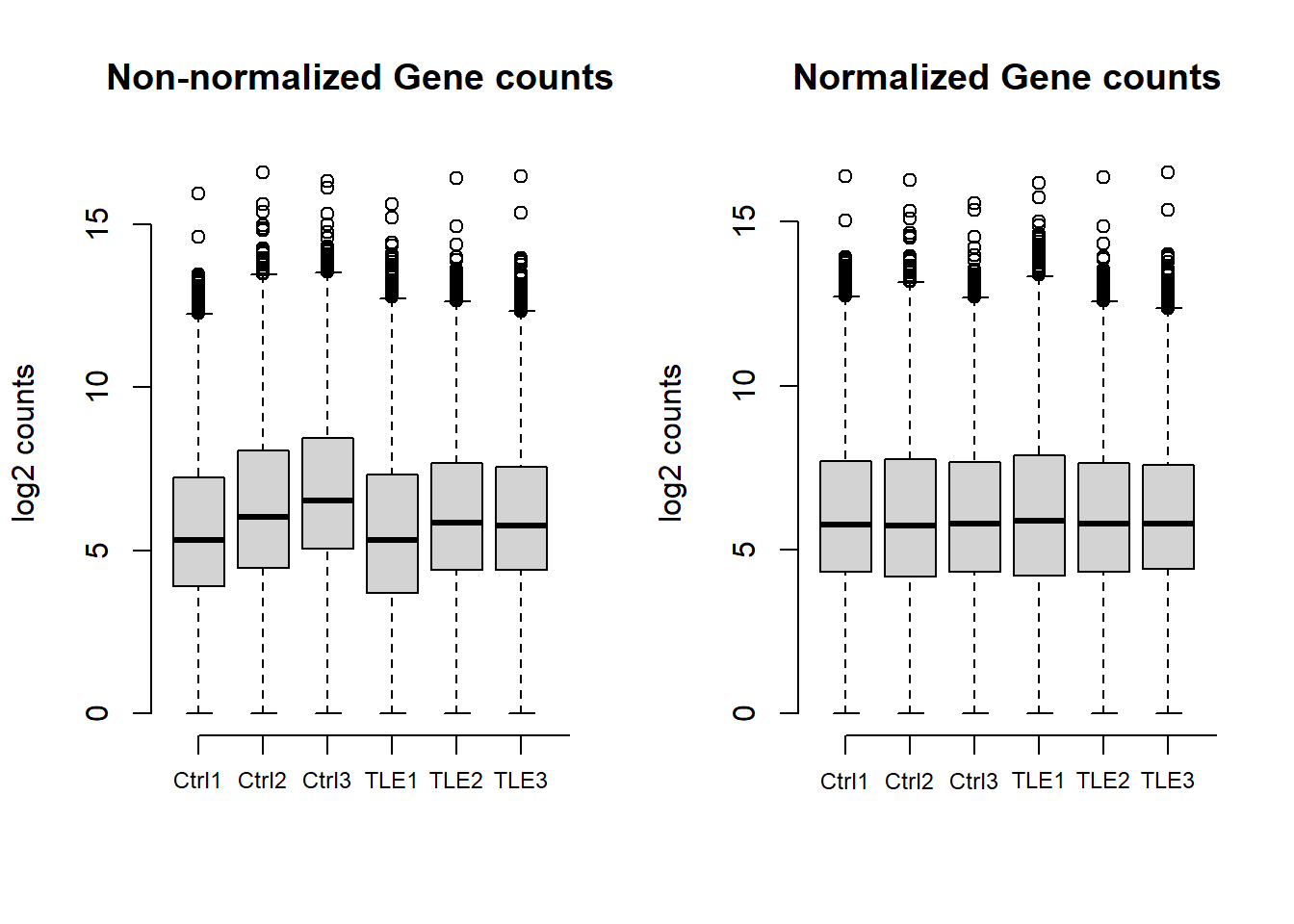
Plot dispersion estimates
A diagnostic plot of how well the data fits the model created by DESeq2 for differential expression testing. Good fit of the data to the model produces a scatter of points (black and blue) around the fitted curve (red). Low expressing genes, with counts below 10 reads across all samples, have been filtered out for computational efficiency.
Click to expand code
# Plot dispersion estimates, good fit of the data to the model produces a scatter of points around
# the fitted curve.
plotDispEsts(dds)
title("Dispersion estimates")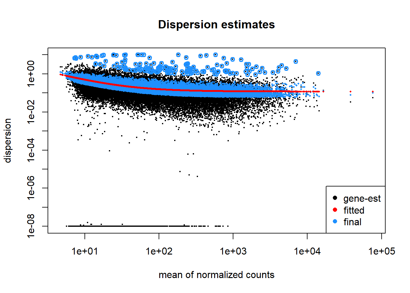
Dimensional reduction analyses
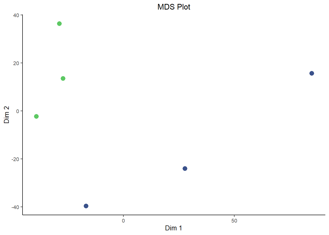
In a way, a lot of omics analysis in really a game of dimensional reduction. You start off with a huge dataset where you have gene expression data for roughly 20,000 genes, each of them it’s own dimension. But some of the analysis techniques, such as clustering, and especially visualizations must be done on a lower number of dimensions, a small handful or maybe even just two.
In comes Principal Component Analysis (PCA) and Multidimensional Scaling (MDS) plots, they serve similar functions to each other and are interpreted in roughly the same way for our purposes here. PCA and MDS are dimensionality reduction techniques used in RNA-Seq analysis to visualize patterns of similarity or difference between samples. They transform high-dimensional gene expression data into a smaller number of dimensions, typically two. Thereby making it easier to detect clustering by condition, batch effects, or outliers. These plots provide an intuitive overview of global transcriptional variation across the dataset.
They differ in how they reduce dimensions. Critically, MDS is plotted in a way such that distances between samples are preserved as much as possible in the projection to lower dimensions. This is similar to the difference between T-SNE plots and UMAP plots, where the distance between clusters is more meaningful in UMAPs while it lacks interpretability in T-SNE plots. However, since MDS is based on preserving pair-wise distance you don’t natively get a measure of how much ‘information’ each dimension carries. That’s in contrast to the measure of variance explained by each dimension that you get out of PCA plots. In that way they both have benefits and are a good compliment to each other.
Click to expand code
plotPCA(rld, intgroup = "condition") + labs(title = "PCA Plot") + theme_bw() + scale_color_viridis_d(begin = 0.75,
    end = 0.25, direction = 1) + theme(text = element_text(size = 10), plot.title = element_text(hjust = 0.5),
    legend.position = "right", panel.border = element_blank(), panel.grid = element_blank(), axis.line = element_line("black"))
## using ntop=500 top features by variancesampleDists <- dist(t(assay(rld)))
sampleDistMatrix <- as.matrix(sampleDists)
mdsData <- data.frame(cmdscale(sampleDistMatrix))
mds <- cbind(mdsData, as.data.frame(colData(rld)))
ggplot(mds, aes(X1, X2, color = condition)) + geom_point(size = 3) + labs(title = "MDS Plot", x = "Dim 1",
y = "Dim 2") + theme_bw() + scale_color_viridis_d(begin = 0.75, end = 0.25, direction = 1) + theme(text = element_text(size = 10),
plot.title = element_text(hjust = 0.5), legend.position = "none", panel.border = element_blank(),
panel.grid = element_blank(), axis.line = element_line("black"))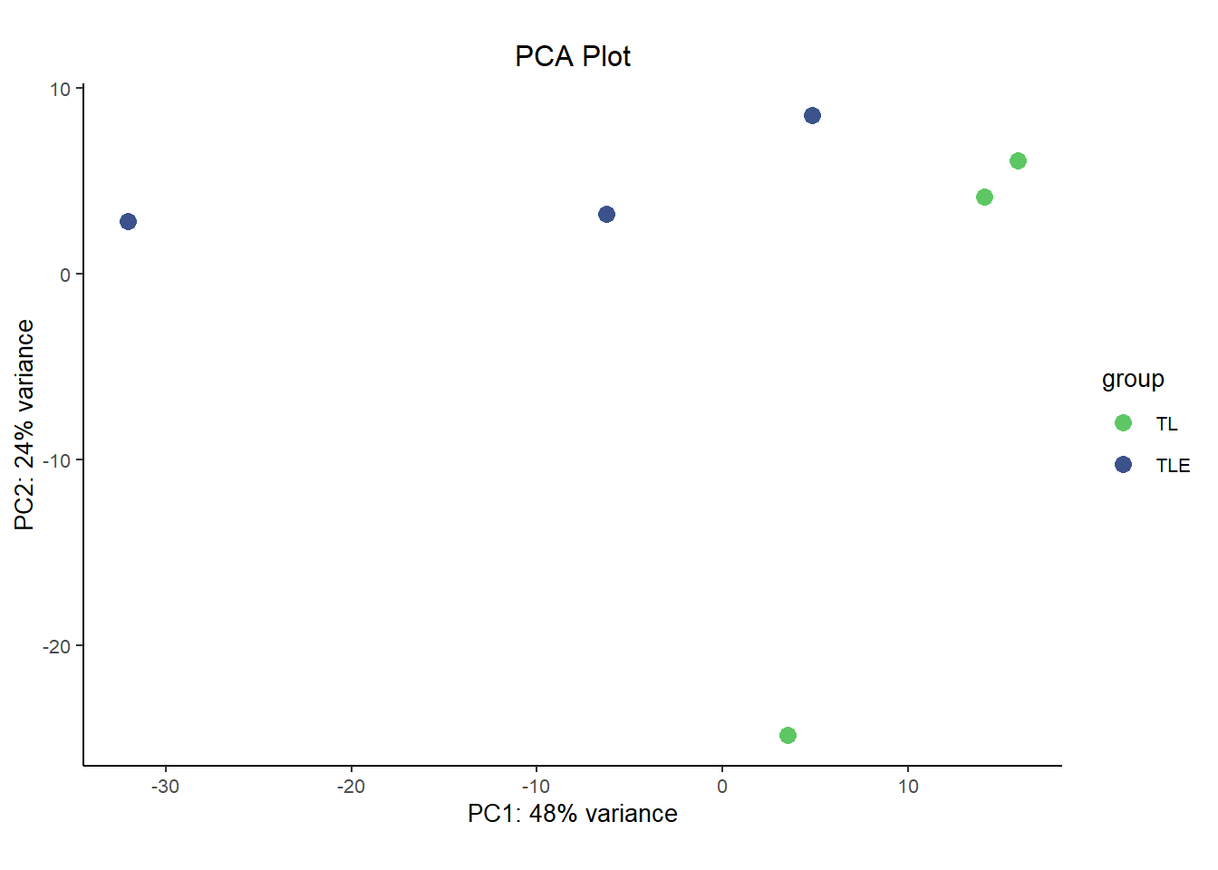
Up-regulated vs. Down-regulated genes
We can see here that there are roughly the same number of up-regulated as down regulated genes as was noted in the results summary and could be seen in the volcano plot. 758 are up-regulated, 818 are down-regulated.
Click to expand code
bar <- data.frame(direction = c("Down", "Up"), genes = c(length(which(res05$log2FoldChange < 0)), length(which(res05$log2FoldChange >
    0))))

# Create barplot
ggplot(bar, aes(x = direction, y = genes, fill = direction)) + geom_col(position = "stack", width = 0.25) +
    scale_fill_viridis(2, begin = 0.3, end = 0.7, direction = 1, discrete = TRUE) + labs(x = NULL, y = "Number of genes",
    fill = "Direction") + theme(legend.title = element_blank(), panel.grid.major = element_blank(), panel.background = element_blank(),
    legend.position = "none", axis.line = element_line(color = "black"), axis.ticks = element_line(color = "black"))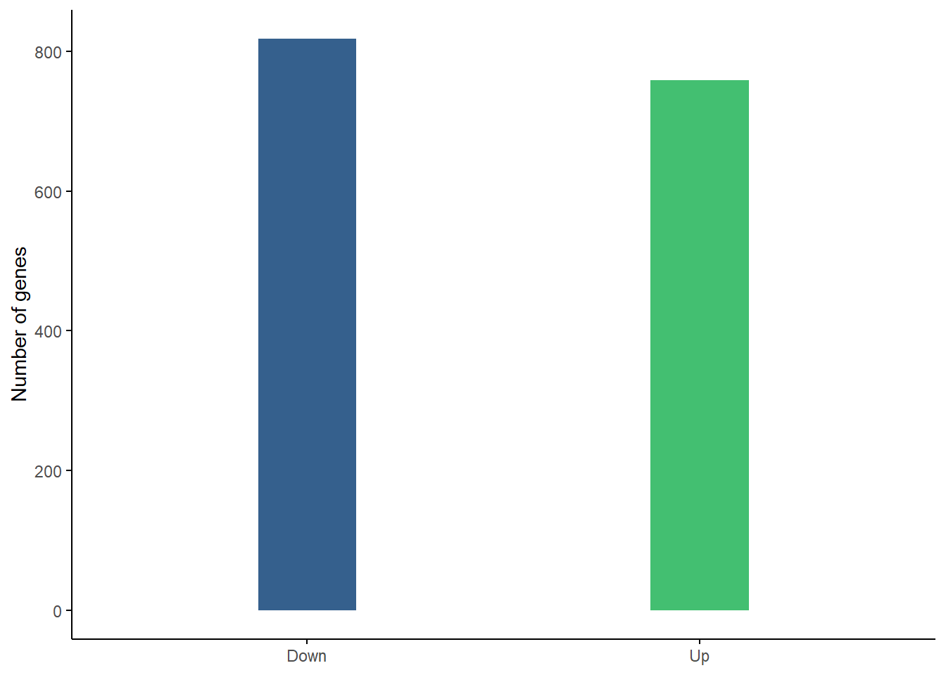
Gene Biotype treemap for all genes
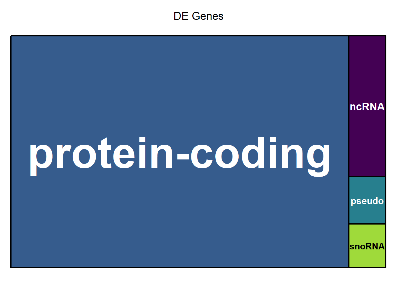
The treemap below shows the relative proportion of each gene biotype for all genes in the dataset. The area of the rectangle is proportional to the percentage of each biotype. The area of each of the rectangles is proportional to the percentage of each biotype when comparing Epilepsy and Control (ref.). The majority are protein coding, which is normal, but protein coding genes make up a significantly higher proportion of differentially expressed genes (right figure).
Click to expand code
# Create treemap of gene biotypes for all genes.
biotype_all <- data.frame(table(mcols(dds)$GENETYPE))
biotype_all$Var1 <- gsub("_", " ", biotype_all$Var1)
biotype_all <- biotype_all[order(biotype_all$Freq, decreasing = TRUE), ]
# remove rows with 0 counts biotype_all <- biotype_all[biotype_all$Freq > 0, ]

# Create treemap of gene biotypes for differentially expressed genes.
resTable$GENETYPE <- as.factor(resTable$GENETYPE)
# levels(resTable$GENETYPE)
biotype_sig <- data.frame(table(resTable$GENETYPE[which(resTable$FDR < 0.05)]))
biotype_sig$Var1 <- gsub("_", " ", biotype_sig$Var1)
biotype_sig <- biotype_sig[order(biotype_sig$Freq, decreasing = TRUE), ]
# remove rows with 0 counts biotype_sig <- biotype_sig[biotype_sig$Freq > 0, ]

# Set up a custom layout layout(matrix(c(1, 2), nrow = 1, ncol = 2))

treemap(biotype_all, index = "Var1", vSize = "Freq", type = "index", palette = viridis(length(biotype_all$Var1)),
    aspRatio = 1.618/1, title = "All Genes", inflate.labels = TRUE, lowerbound.cex.labels = 0)

treemap(biotype_sig, index = "Var1", vSize = "Freq", type = "index", palette = viridis(length(biotype_sig$Var1)),
    aspRatio = 1.618/1, title = "DE Genes", inflate.labels = TRUE, lowerbound.cex.labels = 0)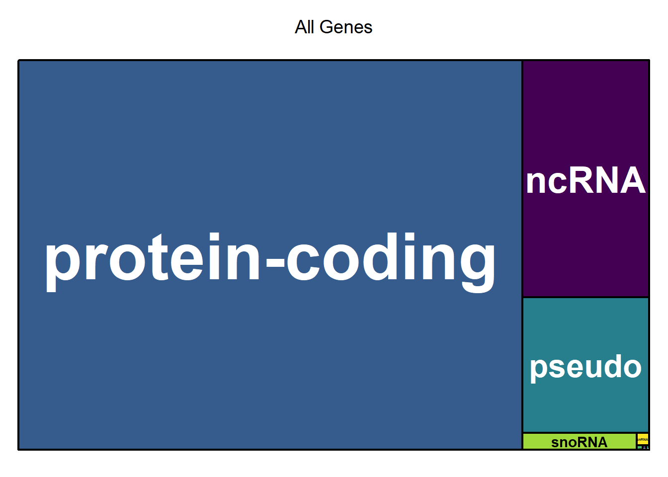
X2 Goodness of fit table
Click to expand code
biotype <- merge(biotype_all, biotype_sig, by = "Var1")
colnames(biotype) <- c("biotype", "AllGenes", "SigGenes")
biotype <- biotype[order(biotype$AllGenes, decreasing = TRUE), ]
# Combine rows with low counts into 'other' for the Chi-squared test.
biotype <- rbind(biotype, c("other", sum(biotype$AllGenes[4:8]), sum(biotype$SigGenes[4:8])))
biotype <- biotype[c(1:3, 9), ]
biotype$AllGenes <- as.integer(biotype$AllGenes)
biotype$SigGenes <- as.integer(biotype$SigGenes)
biotype$AllProp <- round(biotype$AllGenes/sum(biotype$AllGenes), digits = 3)
biotype$SigProp <- round(biotype$SigGenes/sum(biotype$SigGenes), digits = 3)
biotype <- biotype[, c(1, 2, 4, 3, 5)]
# biotype Perform Chi-Squared Goodness-of-Fit Test Compute total counts
total_all <- sum(biotype$AllGenes)  # Total genes
total_sig <- sum(biotype$SigGenes)  # Total significant genes

# Duplicate dataframe for table and rename columns for readability
biotable <- biotype
colnames(biotable) <- c("Biotype", "All Genes", "Proportion (All)", "Significant Genes", "Proportion (Sig.)")

# Compute expected counts under the null hypothesis
biotype$Expected <- total_sig * (biotype$AllGenes/total_all)
chi_sq_test <- chisq.test(biotype$SigGenes, p = biotype$AllGenes/total_all, rescale.p = TRUE)
# Print results print(chi_sq_test)

# Create the static table
biotable %>%
    kbl(format = "html", align = c("l", "r", "r", "r", "r"), row.names = FALSE, caption = paste0("Table 2: Proportion of each gene biotype when comparing ",
        status[2], " and ", status[1], " (ref.). The majority are protein-coding, which make up an even higher proportion of the significantly differentially expressed genes.")) %>%
    kable_styling(full_width = TRUE, bootstrap_options = c("striped", "hover", "condensed"), font_size = 13,
        position = "center") %>%
    column_spec(1, border_left = TRUE, border_right = TRUE) %>%
column_spec(2:5, width = "8em", border_left = TRUE, border_right = TRUE)| Biotype | All Genes | Proportion (All) | Significant Genes | Proportion (Sig.) |
|---|---|---|---|---|
| protein-coding | 14225 | 0.799 | 1160 | 0.901 |
| ncRNA | 2174 | 0.122 | 77 | 0.060 |
| pseudo | 1242 | 0.070 | 26 | 0.020 |
| other | 156 | 0.009 | 24 | 0.019 |
There is a statistically significant difference in the proportion of gene types when comparing the full dataset to the subset of differentially expressed genes (X2 = 117.371, df = 3, p-value = 2.842e-25).
Session info
Session Info provides details about the computational environment used for this analysis, including the versions of R, loaded packages, and system settings. This ensures that the analysis can be reproduced accurately in the future, even if software updates change how certain functions behave.
Click to expand code
sessionInfo()## R version 4.4.1 (2024-06-14 ucrt)
## Platform: x86_64-w64-mingw32/x64
## Running under: Windows 11 x64 (build 26100)
##
## Matrix products: default
##
##
## locale:
## [1] LC_COLLATE=English_United States.utf8
## [2] LC_CTYPE=English_United States.utf8
## [3] LC_MONETARY=English_United States.utf8
## [4] LC_NUMERIC=C
## [5] LC_TIME=English_United States.utf8
##
## time zone: America/Phoenix
## tzcode source: internal
##
## attached base packages:
## [1] grid stats4 stats graphics grDevices utils datasets
## [8] methods base
##
## other attached packages:
## [1] tibble_3.2.1 kableExtra_1.4.0
## [3] EnhancedVolcano_1.22.0 ggrepel_0.9.6
## [5] pheatmap_1.0.12 plotly_4.10.4
## [7] vsn_3.72.0 gridExtra_2.3
## [9] treemap_2.4-4 DESeq2_1.44.0
## [11] SummarizedExperiment_1.34.0 Biobase_2.64.0
## [13] MatrixGenerics_1.16.0 matrixStats_1.5.0
## [15] GenomicRanges_1.56.2 GenomeInfoDb_1.40.1
## [17] IRanges_2.38.1 S4Vectors_0.42.1
## [19] BiocGenerics_0.50.0 viridis_0.6.5
## [21] viridisLite_0.4.2 Glimma_2.14.0
## [23] limma_3.60.6 ggplot2_3.5.1
##
## loaded via a namespace (and not attached):
## [1] formatR_1.14 rlang_1.1.4 magrittr_2.0.3
## [4] gridBase_0.4-7 compiler_4.4.1 systemfonts_1.2.1
## [7] vctrs_0.6.5 stringr_1.5.1 pkgconfig_2.0.3
## [10] crayon_1.5.3 fastmap_1.2.0 XVector_0.44.0
## [13] labeling_0.4.3 promises_1.3.2 rmarkdown_2.29
## [16] UCSC.utils_1.0.0 preprocessCore_1.66.0 purrr_1.0.4
## [19] xfun_0.51 zlibbioc_1.50.0 cachem_1.1.0
## [22] jsonlite_1.8.8 later_1.4.1 DelayedArray_0.30.1
## [25] BiocParallel_1.38.0 irlba_2.3.5.1 parallel_4.4.1
## [28] R6_2.6.1 bslib_0.9.0 stringi_1.8.4
## [31] RColorBrewer_1.1-3 SQUAREM_2021.1 jquerylib_0.1.4
## [34] Rcpp_1.0.14 knitr_1.49 httpuv_1.6.15
## [37] Matrix_1.7-0 igraph_2.1.4 tidyselect_1.2.1
## [40] rstudioapi_0.17.1 abind_1.4-8 yaml_2.3.10
## [43] codetools_0.2-20 affy_1.82.0 lattice_0.22-6
## [46] shiny_1.10.0 withr_3.0.2 evaluate_1.0.3
## [49] xml2_1.3.6 pillar_1.10.1 affyio_1.74.0
## [52] BiocManager_1.30.25 generics_0.1.3 invgamma_1.1
## [55] truncnorm_1.0-9 munsell_0.5.1 scales_1.3.0
## [58] ashr_2.2-63 xtable_1.8-4 glue_1.7.0
## [61] lazyeval_0.2.2 tools_4.4.1 data.table_1.17.0
## [64] locfit_1.5-9.11 tidyr_1.3.1 crosstalk_1.2.1
## [67] edgeR_4.2.2 colorspace_2.1-1 GenomeInfoDbData_1.2.12
## [70] cli_3.6.3 mixsqp_0.3-54 S4Arrays_1.4.1
## [73] svglite_2.1.3 dplyr_1.1.4 gtable_0.3.6
## [76] sass_0.4.9 digest_0.6.36 SparseArray_1.4.8
## [79] farver_2.1.2 htmlwidgets_1.6.4 htmltools_0.5.8.1
## [82] lifecycle_1.0.4 httr_1.4.7 statmod_1.5.0
## [85] mime_0.12
Leave a comment